Inside DataClarity 2023.4: Enhanced Data Preparation, UI/UX Improvements, and more

Support for Amazon RDS connections
This release introduces new improvements to data preparation capabilities. You can now seamlessly connect and query Amazon Relational Database Service (RDS), including the following:
- Amazon RDS for MySQL
- Amazon RDS for MariaDB
- Amazon RDS for PostgreSQL
- Amazon RDS for Oracles
- Amazon RDS for SQL Server
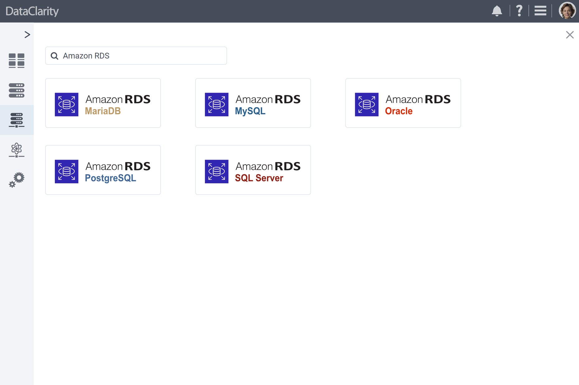
This enhancement broadens your possibilities for accessing and utilizing data, giving you the flexibility to connect to Amazon RDS databases that best fit your needs.
Whether you’re working with MySQL, MariaDB, PostgreSQL, Oracle, or SQL Server, our platform now provides seamless integration with Amazon RDS databases, making data access and utilization more versatile than ever.
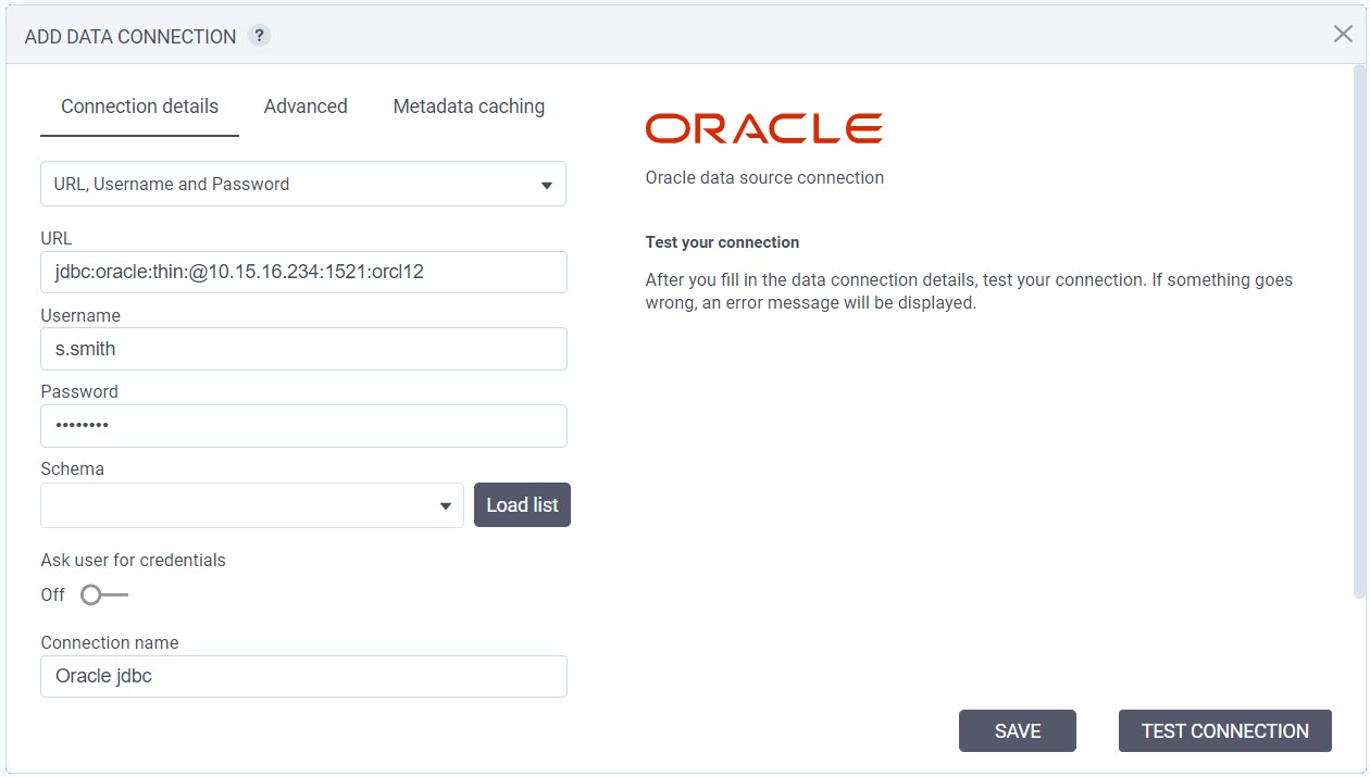
Improved Connection Setup with JDBC URLs
We’re excited to introduce an enhancement to data preparation that simplifies the process of defining database connections. You can now choose between specifying individual connection configuration fields or simply providing a JDBC URL.
When defining a database connection, you have the option to specify a JDBC URL directly. This feature is particularly useful when you need to copy and paste JDBC URLs from other applications, reducing the manual input required.
Addition of Key/Value Type JDBC Parameters
In response to user feedback and to expand the flexibility of data connection configuration, we’re excited to introduce an enhancement that allows users to specify additional data connection parameters using a convenient key/value pair approach.
You now have access to a dedicated connection configuration tab, enabling the addition of key/value type JDBC parameters. This enhancement greatly enhances the versatility of the data connection setup.
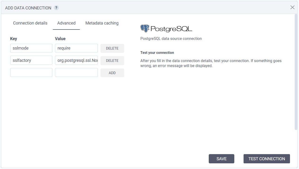
Before this update, users were limited to the required fields in the connection form. With the new key/value pair approach, you have the freedom to add any necessary JDBC parameters, ensuring a seamless and tailored connection setup for your specific requirements. This feature empowers users to fine-tune their data connection configurations with ease.
SSL Connectivity Support for PostgreSQL, SQL Server, and MySQL
This release introduces enhanced security options with the addition of SSL connectivity support for PostgreSQL, SQL Server, and MySQL databases. Whether your databases are on-premises or in the cloud, this feature provides an extra layer of protection for your data.
To enable SSL connectivity, we’ve introduced a convenient toggle in the connection configuration. When you activate this feature, our platform automatically adds the appropriate JDBC parameters to enable SSL to the “Advanced Key Value” configuration tab.
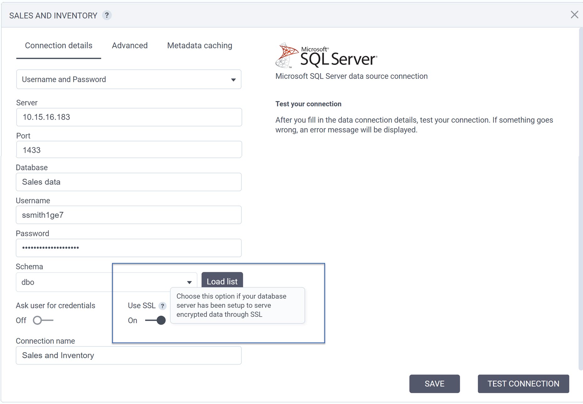
This means you have full control and visibility over SSL-related settings, allowing you to review and fine-tune them as needed. Whether you’re connecting to PostgreSQL, SQL Server, or MySQL databases, this SSL support ensures your data transmissions are secure and protected, meeting the highest standards of data security.
Store Extracted Datasets in External PostgreSQL Databases
Starting this release, when creating datasets, you have the ability to store extracted data in an external PostgreSQL database, expanding your storage choices.
While accelerating query performance by configuring datasets to use extracted data, you now have the option to specify whether the extracted data will be stored in our internal columnar data storage or in an external PostgreSQL database.
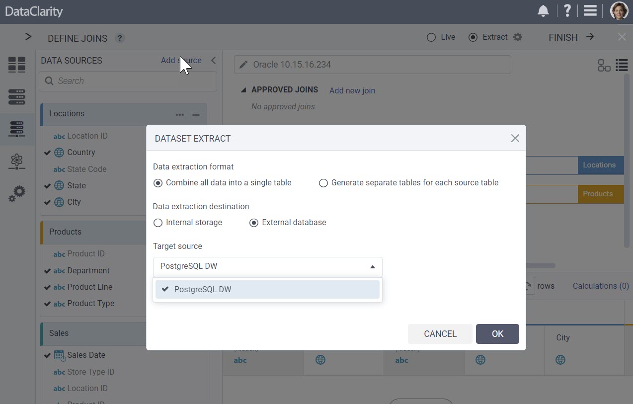
To use this feature, first define a PostgreSQL data connection in Data Preparation. Once the connection is established, you can select it as the destination for your data extracts.
This enhancement empowers you with greater control over your data storage and management.
Source Tables and Views Grouped by Object Type
This new release introduces an improvement that organizes source tables and views by object type. This enhancement ensures a more user-friendly and organized interface when selecting data sources.
Previously, when creating datasets and selecting tables and columns from data sources, both database tables and views were displayed together. Now we’ve reorganized the interface to display source tables and views grouped by their object types. You’ll now see distinct categories labeled “Tables” and “Views,” with tables and views listed under their respective categories.
This update simplifies the dataset creation process, making it easier for you to select the specific data sources you need.
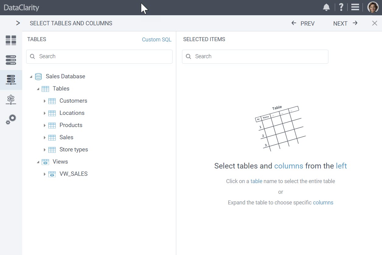
Table and Column Metadata Refresh Option
This release brings a valuable enhancement that empowers users to refresh tables and columns metadata while selecting tables for dataset creation.
Now, users can easily refresh tables and columns metadata without requiring special privileges to manage the source connection or having to navigate to the connection configuration to clear metadata caching.
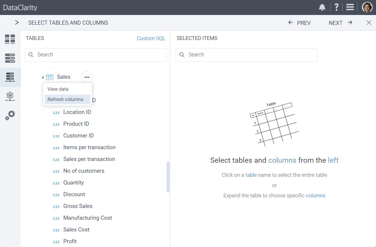
To refresh tables and columns metadata while in the process of selecting tables and columns for dataset creation, simply click the “Options Menu”, and then click “Refresh columns”. This action triggers the metadata refresh, ensuring you have access to the most up-to-date information.
Enhanced Table and Column Selection with Data Type Information
We’re excited to introduce an enhancement that significantly improves the dataset creation process. Now, when selecting tables and columns from a database source, you have enhanced visibility into the data types of each column, making it easier to identify and choose the right data sources.
In past releases, users were able to view the data types of table columns during the data preview step only. With this new release, you can now see the data type of each column in a table, identified by intuitive icons for numeric, string, date, or date time data types.
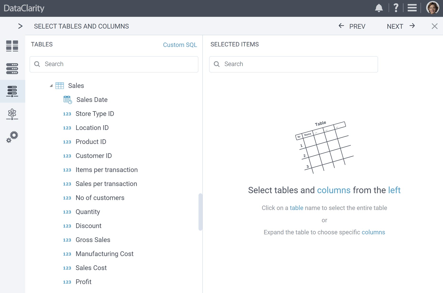
This improvement streamlines the dataset and table selection process, allowing you to quickly identify and choose columns based on their data types. Whether you’re searching for date columns, numeric values, or specific data types, this feature makes it easier than ever to select the right data sources for your datasets.
Exclude and Keep-Only Selected Value
This new release introduces a feature that takes data curation and transformation during dataset creation to the next level.
Now, you can quickly curate and transform your data by excluding or keeping only selected values, simplifying and expediting the data preparation process. Right-click on a table preview grid view to:
- Exclude Selected Value – choose to exclude the selected cell value from the dataset.
- Keep Only Selected Value – opt to keep only the selected cell value, filtering out other data.
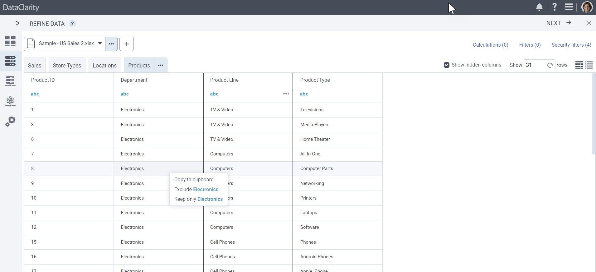
These additional quick actions provide a powerful toolset for refining your data with precision. Whether you need to exclude specific values or retain only the ones you select, this feature enhances your ability to prepare data efficiently and effectively.
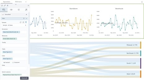
Default Aggregated View for Data Exploration
Now, when you select a dataset for exploration, the data aggregation toggle is turned on by default. When you add dataset columns to explore the data, the results are displayed in an aggregated view, simplifying your initial data analysis.
Additionally, when “Group Data” is activated, measures are automatically set to be aggregated using the default aggregation configuration established when the dataset was created. For example, if “Profit” was defined with a default aggregation of “Sum” during dataset creation, in exploration with “Group Data” enabled, “Profit” will automatically use the “Sum” aggregation. You can still customize the aggregation for measures by clicking on them.
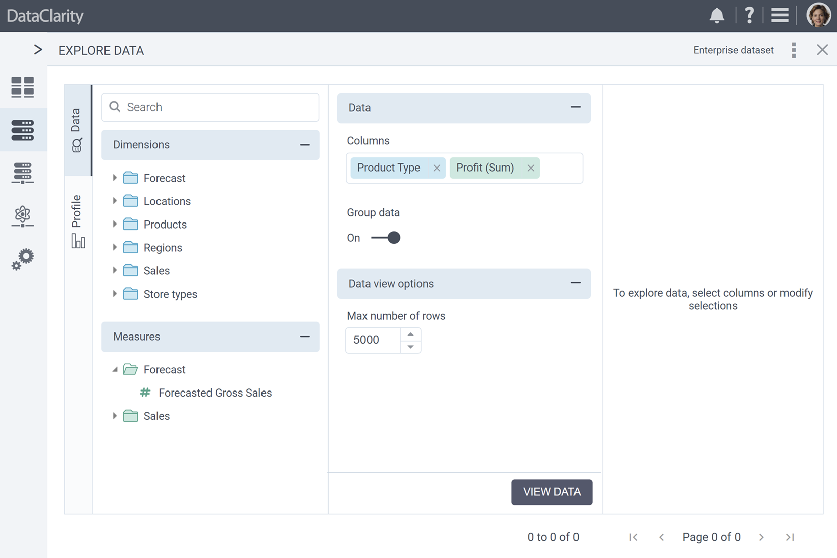
This enhancement streamlines the data exploration process, providing you with a simplified starting point for your analysis while still allowing for flexibility when you need to switch to detailed data or customize aggregations.
Extended User-Friendly Numeric Column Filter Interface to End-Users
In our ongoing commitment to enhancing user experiences, we’re thrilled to introduce a significant improvement that simplifies the process of specifying numeric column filter criteria within storyboards. Previously available exclusively to authors when specifying data filters for charts, this enhancement now provides end-users with the same user-friendly numeric column filter interface.

Users can now select filter operations from a dropdown menu, including options like “less than”, “less than or equal to”, “greater than”, “greater than or equal to”, “between”, “in list”, “not in list”, “is null”, and “is blank”.
Depending on the selected operation, the UI dynamically adapts to display the relevant fields required to specify the filter criteria. For example, if “greater than” is selected, the UI provides an input field for users to specify the value for the greater expression.
Expanded Trigger Event Options for Charts Custom Actions
In this new release, we’ve expanded the trigger event options for “Charts Custom Actions”. Previously, while we offered various trigger events for pre-defined actions such as “Left Click”, “Right Click”, “Title Click”, and “Mouse Over”, custom actions were limited to chart title and chart content click.
With this enhancement, we’ve extended the trigger event options for Custom Actions to include:
- Left Click – trigger custom actions with a left click event.
- Right Click – perform custom actions with a right-click event.
- Hover – enhance interactivity with custom actions triggered by hovering over elements.
- Double Click – execute custom actions with a double click event.
These new trigger event options empower you to create more interactive and dynamic storyboards, by controlling the behavior of your charts and widgets with more accuracy.
Conditional Formatting with Value Overrides for Null and Blank Values in Table Columns
A new feature introduced in this release allows you to override values using conditional formatting, with a focus on null or blank values in table columns.
Conditional formatting is commonly used when dealing with null or blank values, allowing authors to display custom messages or alternate values for improved data presentation.
With this enhancement, you can now configure conditional formatting rules to override values, ensuring that your table columns effectively communicate custom messages or alternative data when needed.
Enhanced Hover Color Customization for Line Elements in Charts
Starting with this release, you can enable and customize hover colors for line elements in various types of charts, expanding the visual possibilities for your data representations. Previously, hover color customization was available for various chart elements, such as bars, columns, maps, bullets, and more, but it did not apply to line-type charts.
With this enhancement, authors can now enable and customize hover colors for line elements in the following chart categories:
- “Line & Marker” charts
- “Column and Line” charts
- “Bar and Line” charts
- “Pareto” charts
This feature empowers you to enhance the visual interactivity of your charts, making it easier to highlight and explore data points within line-type charts. This brings greater control over the appearance of your charts, ensuring your data is presented exactly the way you want it to be.
Enhanced Trellis Title Styling for Clearer Chart Visualizations
Users are empowered to configure the appearance of “Trellis Titles” when utilizing a “Trellis” column in charts. This enhancement ensures more visually appealing chart visualizations.
When configuring charts with the “Trellis” option, you’ll now have the ability to style and customize “Trellis Titles” for each chart generated based on the “Trellis” column.
The enhanced “Trellis Title” styling options include:
- Show/Hide – you can choose to show or hide the Trellis Title based on your visualization preferences.
- Font Type – select the font type that best suits your chart’s aesthetic.
- Font Size – adjust the font size to ensure clear visibility.
- Font Bold – emphasize Trellis Titles by applying bold formatting.
- Font Color – choose the font color that complements your chart design.
This enhancement provides you with the flexibility to fine-tune the appearance of “Trellis Titles”, enhancing the clarity and customization of your chart visualizations.
UX Improvements for Enhanced User Experience
We’ve rolled out a series of UX enhancements aimed to make data preparation and storyboards even more user-friendly and efficient.
Here are just a few of the improvements:
- Streamlined Interface – we’ve revamped the interface to provide a smoother user journey.
- Consistent Naming – we’ve adopted uniform naming convention for seamless understanding.
- Intuitive UI – experience a more self-explanatory user interface for effortless navigation.
- Enhanced Error Handling – clearer error messages help you address issues more effective.
- Tooltip Refinement – tooltips have been refined to provide improved guidance.
- User Action Consistency – common actions are more intuitive and predictable.
- Success Feedback – celebrate accomplishments with improved success messages.
These UX improvements empower you to work effortlessly with your data, delivering a more user-friendly and efficient experience in data preparation and storyboards.
UI Performance Optimization for Faster Rendering
We’re thrilled to announce UI performance enhancements that ensure faster rendering and eliminate any visible lags for end-users. This optimization focuses on loading chart table widgets classes before requesting data, resulting in improved table UI rendering and minimized CSS files.
Want to learn more?
-
- Download the latest version today!
- Download Release Notes 2023.4 now!
- Explore all DataClarity releases.
- Get an overview of DataClarity Unlimited Analytics.
You might also be interested in…
-
 Releases
Now available in DataClarity 2023.3: New KPI Widget, Custom JavaScript Code for Chart Actions, and more

Explore the latest features designed to help you create visualizations that are more meaningful, personalized, and interactive, leading to deeper insights into your business. -
Releases
Inside DataClarity 2023.2: Relative Time Calcs, Chart Filters on Aggregated Measures, and more
DataClarity 2023.2 release introduces the capability to employ chart filters on aggregated measures, instantly switch columns, perform relative time calculations, actions for Bullet charts, and more. -
Releases
Explore DataClarity 2023.1: Data Table Conditional Formatting, Custom Maps (GeoJSON), and more
Learn what’s new in DataClarity 2023.1, including parameter maps, bulk formatting, improved storyboard navigation, the ability to rename columns in all charts, and more.