Inside DataClarity 2023.2: Relative Time Calculations, Chart Filters on Aggregated Measures, and more

Incorporate relative time calculations within your datasets
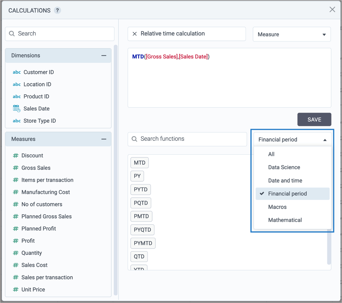
You can now integrate relative time calculations into your datasets. These calculations dynamically update data for specific time periods, aligned with the date you’re previewing the calculation within the dataset. This feature is especially useful for a comprehensive analysis of recent financial data.

To incorporate these calculations, go to the calculations editor, and apply a filter to the calculations by selecting Fiscal period. Then you can choose from a variety of options, including:
-
- YTD – year to date
- QTD – quarter to date
- MTD – month to date
- PY – entire prior year
- PYTD – prior year to date
- PYQTD – prior year quarter to date
- PYMTD – prior year month to date
- PMTD – prior month to date
- PQTD – prior quarter to date
Filter over aggregated measures
A recent enhancement empowers you to apply filters to aggregated data within visualizations that group measures by dimensions. In the past, filters exclusively impacted raw data values. However, you now have the ability to specify whether a filter condition applies to aggregated or non-aggregated data.
To set up this filter, proceed as follows:
- Open the Filters
- Move to the After Aggregation
- Set up filter conditions to activate subsequent to the aggregation of the relevant measure.
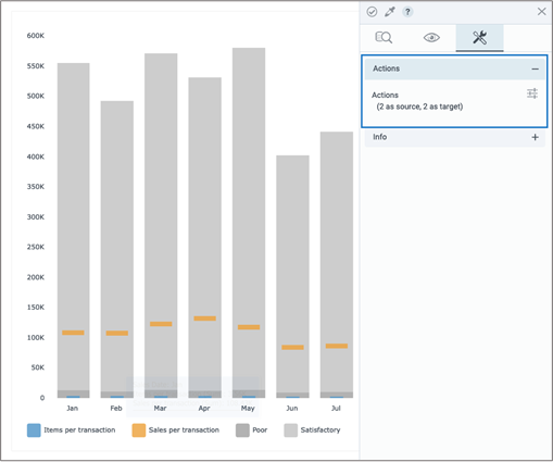
Configure actions for Bullet charts
Now you have the capability to set up actions for both Bullet column and Bullet bar charts, fostering interactivity among widgets. This is achieved through the Actions pane, where you can establish a bullet chart as either the target or source for various available actions.
Switch columns on-the fly
In this release, you can effortlessly swap measures, dimensions, and color-coded columns with other predetermined ones during visualization previews. This permits you to conveniently explore your data from various angles without having to open the widget editor.
To get started, just select the columns you want to switch to in the widget settings under the Switch columns menu.
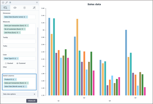
Next, simply hover over the column you wish to modify and pick a column from your preselected options within the widget editor.
Add relative time calculations to storyboards
You can now include relative time calculations in your visualizations for enhanced data analysis. These calculations dynamically refresh data for specific time spans, like year-to-date, relative to the date you’re previewing in the storyboard. This is especially useful for analyzing the latest financial data.
Want to learn more?
-
- Download the latest version today!
- Download Release Notes 2023.2 now!
- Explore all DataClarity releases.
- Get an overview of DataClarity Unlimited Analytics.
You might also be interested in…
-
 Releases
Inside DataClarity 2023.4: Enhanced UI/UX and Data Prep, and more

DataClarity 2023.4 delivers modern innovation and sustainable free data and analytics capabilities for ISV’s, SaaS providers, and IT teams. -
 Releases
Now available in DataClarity 2023.3: New KPI Widget, Custom JavaScript Code for Chart Actions, and more
Explore the latest features designed to help you create visualizations that are more meaningful, personalized, and interactive, leading to deeper insights into your business. -
Releases
Explore DataClarity 2023.1: Data Table Conditional Formatting, Custom Maps (GeoJSON), and more
Learn what’s new in DataClarity 2023.1, including parameter maps, bulk formatting, improved storyboard navigation, the ability to rename columns in all charts, and more.

