Now available in DataClarity 2023.3: New KPI Widget, Custom JavaScript Code for Chart Actions, and more

New KPI Widget
Within this release, we are introducing the capability to generate Key Performance Indicator (KPI) visualizations through the KPI widget. By providing a concise and visually intuitive representation of performance metrics, KPI visualizations empowers users to assess performance metrics with greater efficiency. Users can quickly grasp the significance of data trends, making it easier to identify areas of success and areas that require attention.
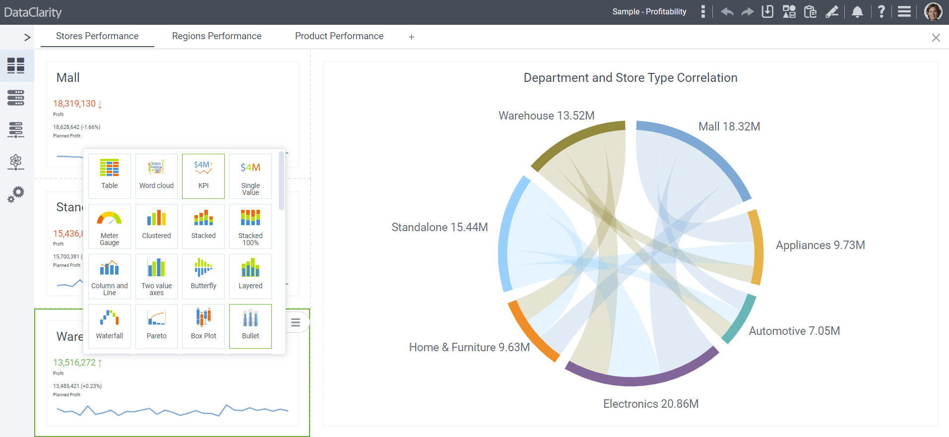
To make use of the KPI widget, switch to Edit mode and click on the Add widget option. Within the section dedicated to KPI & Gauge visualizations, the KPI widget will be conveniently accessible to create KPI visualizations.
Conditional formatting for KPI visualizations
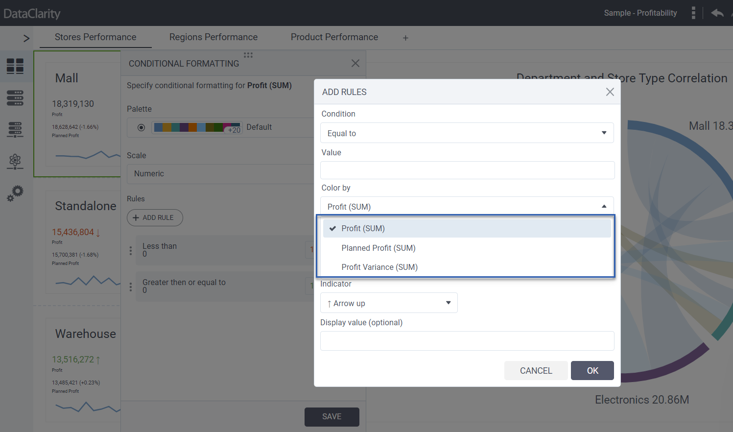
This release incorporates the integration of conditional formatting for KPI visualizations, ushering in a new level of visual sophistication to data representation. Users can apply formatting rules based on specific conditions, allowing for real-time monitoring and highlighting of critical performance
thresholds.
This empowers users to discern trends, variations, and critical insights by applying dynamic formatting rules to KPI data.
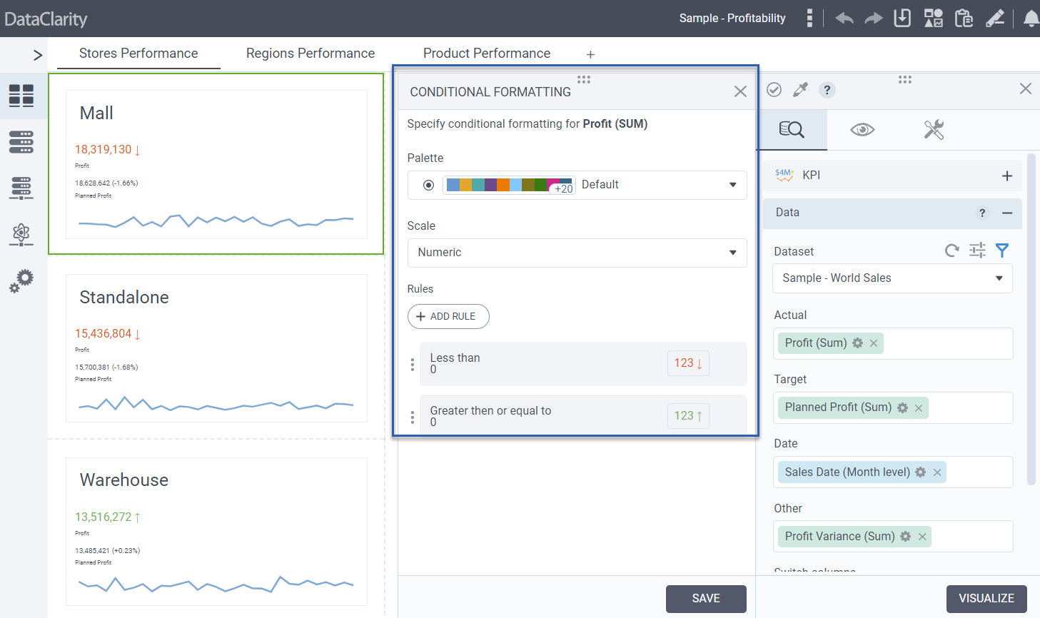
To implement formatting rules, navigate to the Data tab, and choose either Actual, Target, or Other indicators. From there, click on the Options menu and select Conditional formatting. This will grant you the ability to add rules, define conditions, modify text or background colors, and perform various related actions.
Expanding the utility of the KPI widget, an Other field is now available, providing users the ability to incorporate additional data categories for comprehensive analysis.
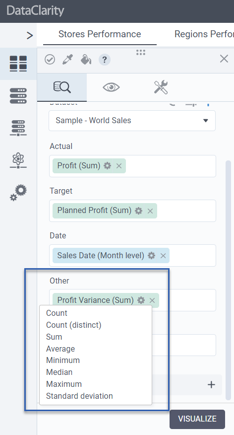
Furthermore, an enriching feature enhancement allows the selection of measures columns, contributing to a more personalized and insightful KPI widget setup.
Color properties for both Actual and Target indicators
In response to user preferences, color properties for both Actual and Target indicators within the KPI widget have been introduced. This level of customization empowers users to tailor the visual representation of performance metrics, enabling more intuitive and meaningful data interpretation.
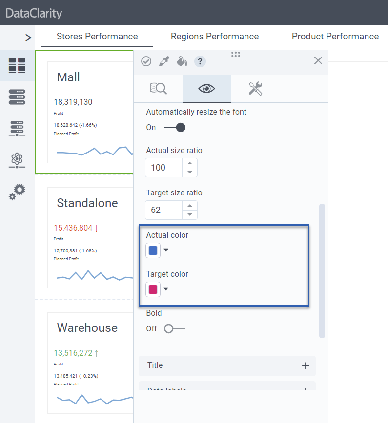
To adjust the color properties of both Actual and Target indicators, access the Appearance tab, proceed to Fonts, and within this section, you’ll be able to individually select the desired color settings for both the Actual and Target indicators.
Continuing the trajectory of customization, a default Text alignment setting has been established for KPI visualizations, specifically aligning text content to the left. This promotes consistency in visual layouts and enhances the overall user experience.
Extend Filter Widget with multi-select dropdown
With this release, we have extended the Filter widget to include a multi-select dropdown option. Users can now simultaneously select multiple filter options from a dropdown, enabling them to explore diverse data subsets and variations in a single interaction. This expedites the process of analyzing complex datasets and gaining comprehensive insights. This capability allows for deeper insight into data patterns, correlations, and trends, leading to more informed decision-making.
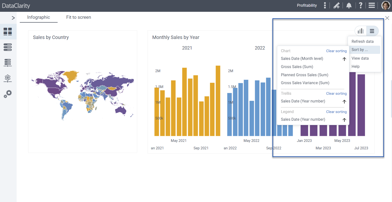
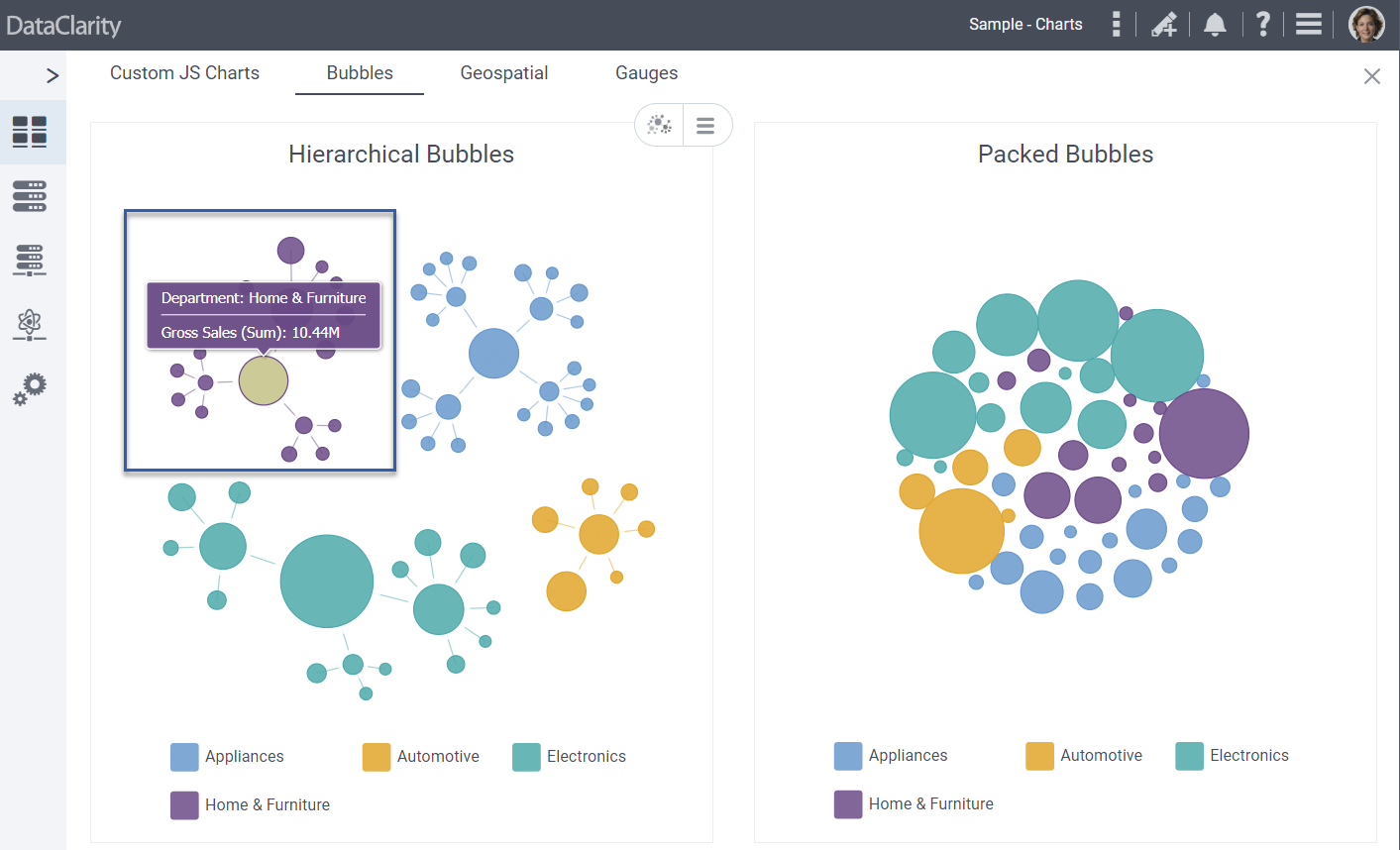
Extend Sort by option across additional chart types
In this release, we’ve expanded the Sort By option to include the following chart types, resulting in significant improvements across various visualization categories:
- Column Bullet Chart
- Bullet Chart
- Tree View Chart
- Hierarchical Bubbles Chart
- Packed Bubbles Chart
- Chord Chart, Sankey Chart
- Treemap Chart.
By incorporating this enhanced functionality across these charts, users gain the power to navigate, analyze, and extract insights from their data with greater efficiency. The ability to personalize the arrangement of data points empowers users to fine-tune their visualization encounters, facilitating the extraction of meaningful insights from complex datasets.
Custom Cron expressions for scheduling storyboards
A new feature was introduced to enable users to define and utilize custom Cron expressions when scheduling storyboards. By introducing this capability, users gain precise control over the scheduling frequency and patterns of their storyboards. This enhancement empowers users to tailor their scheduling approach according to specific business requirements and operational needs.
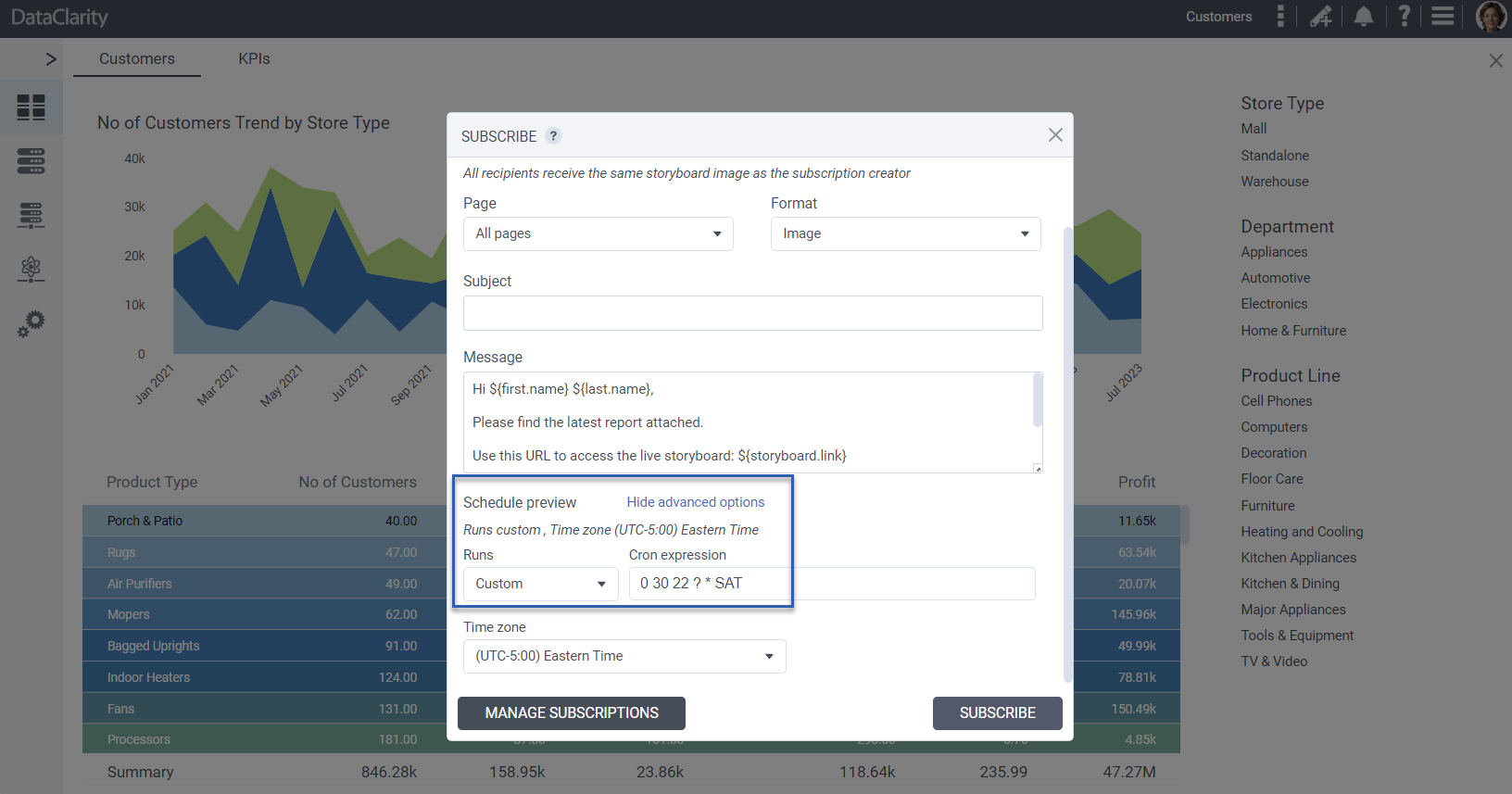
Whether it’s setting up complex recurring schedules or aligning storyboards with intricate timeframes, the custom Cron expression feature provides an advanced level of scheduling customization. This results in enhanced adaptability and efficiency when orchestrating storyboard presentations, ensuring that critical insights are delivered at the right time and frequency.
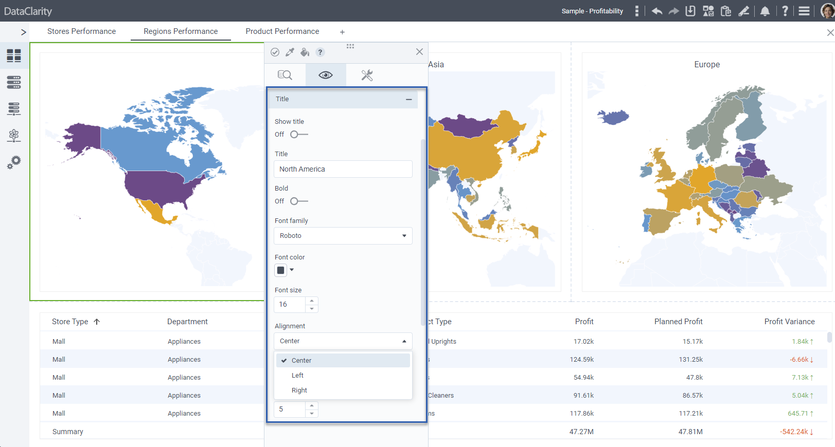
Control chart title position
The introduction of the Control chart title position feature offers users enhanced flexibility in visualizing their data. By allowing users to precisely position the title of a chart, this feature ensures optimal alignment and presentation of critical information.
Users can now place chart titles strategically to avoid overlapping with data points, labels, or other visual elements, ensuring a clear and unobstructed view of insights. Whether the chart title needs to be centered, left-aligned, or right-aligned, this feature enables users to customize the title position based on their design preferences and storytelling requirements.
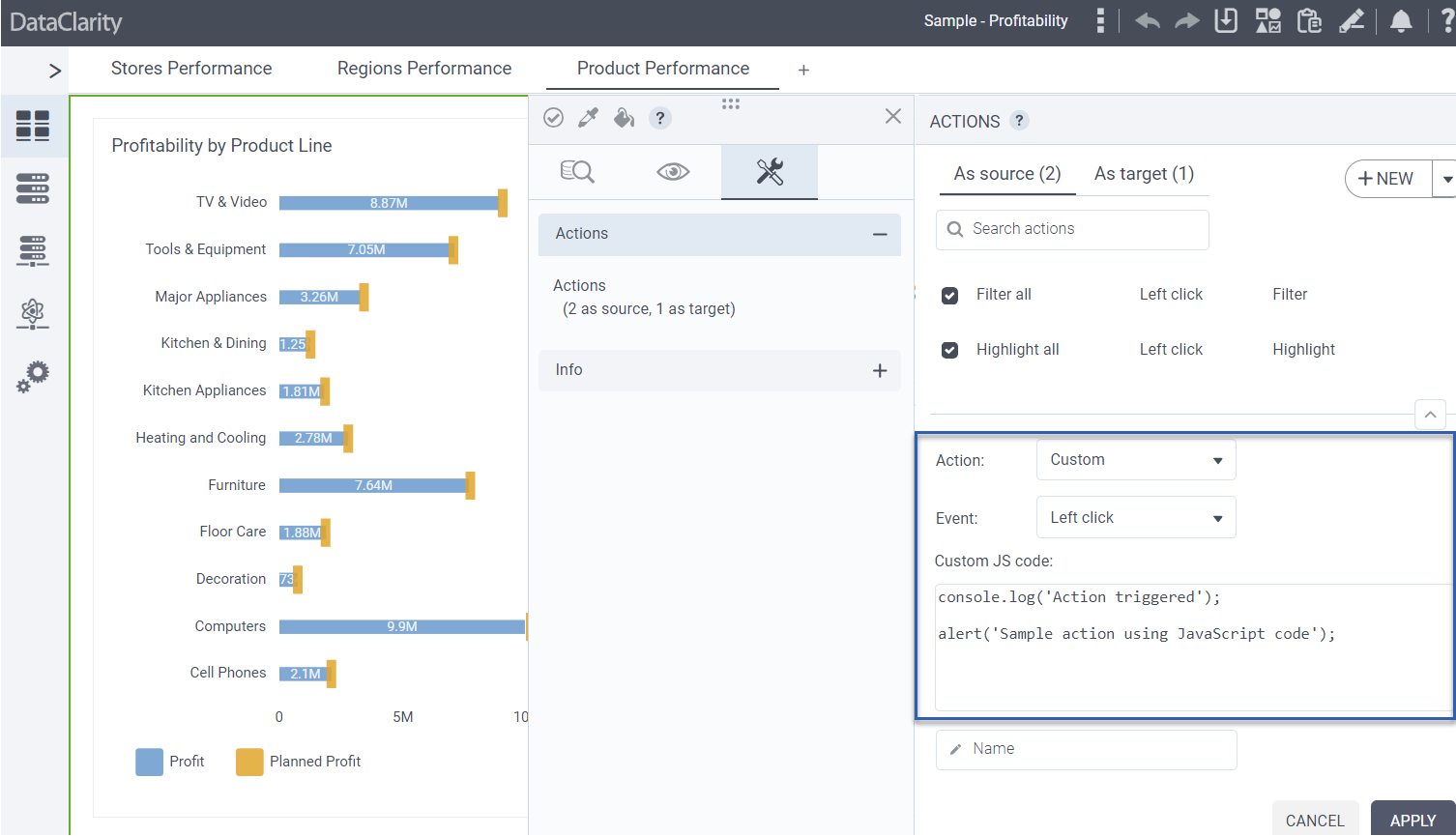
Custom JavaScript code for chart actions
In this release we are thrilled to unveil the capability of integrating custom JavaScript code for chart actions, marking a significant advancement in interactivity and customization for data visualizations. By empowering users with heightened control over chart behavior and interactions, this feature facilitates quicker insights and analysis.
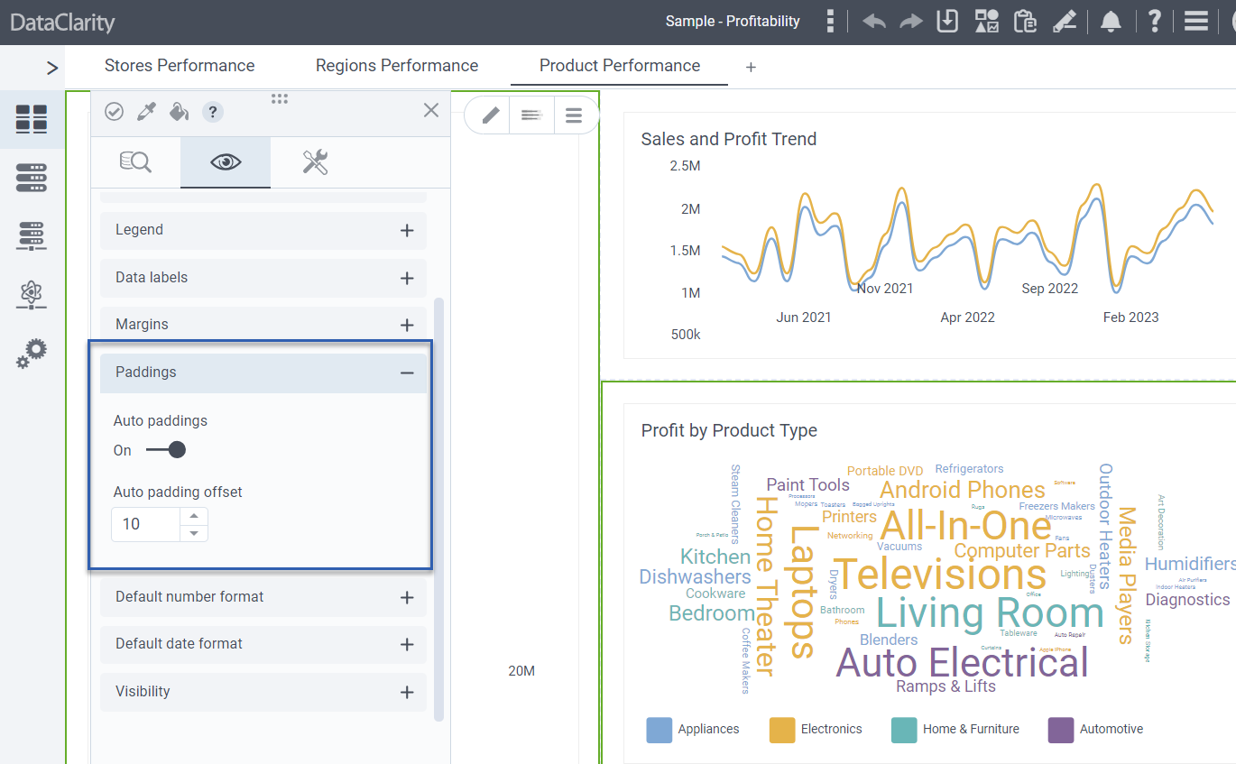
Padding for charts and KPI widget
In this release, we are excited to introduce two powerful features that enhance the design and layout of charts and KPI widget: the addition of padding controls and auto padding offset.
With the new padding controls, users can fine-tune the distance between the content and the edges of the visualization canvas. By adjusting padding, users can create cleaner, more organized layouts that highlight key data points and improve overall visual clarity.
In addition, auto padding offset intelligently analyzes the content and structure of charts and KPI widgets, automatically calculating and applying a default padding size of 10px.
Set hover color to standard charts
The addition of setting hover color to regular charts marks a significant enhancement in data visualization customization. With this feature, users can now define a specific hover color for elements within standard charts, including but not limited to bar charts, line charts, and scatter plots.
This capability fosters deeper data exploration, clearer communication of insights, and a more engaging experience for both creators and consumers of the visualizations.
Want to learn more?
-
- Download the latest version today!
- Download Release Notes 2023.3 now!
- Explore all DataClarity releases.
- Get an overview of DataClarity Unlimited Analytics.
You might also be interested in…
-
 Releases
Inside DataClarity 2023.4: Enhanced UI/UX, Data Preparation, and more

DataClarity 2023.4 delivers modern innovation and sustainable free data and analytics capabilities for ISV’s, SaaS providers, and IT teams. -
Releases
Inside DataClarity 2023.2: Relative Time Calcs, Chart Filters on Aggregated Measures, and more
DataClarity 2023.2 release introduces the capability to employ chart filters on aggregated measures, instantly switch columns, perform relative time calculations, actions for Bullet charts, and more. -
Releases
Explore DataClarity 2023.1: Data Table Conditional Formatting, Custom Maps (GeoJSON), and more
Learn what’s new in DataClarity 2023.1, including parameter maps, bulk formatting, improved storyboard navigation, the ability to rename columns in all charts, and more.