Explore DataClarity 2023.1: Data Table Conditional Formatting, Custom Maps (GeoJSON), and more

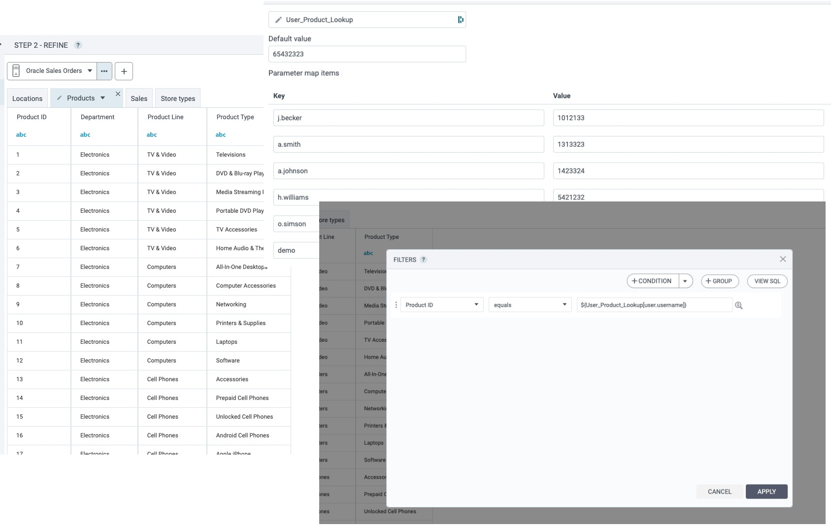
Use parameter maps
Starting with this release, you can configure and use parameter maps for data preparation and visualizations. Parameter maps are objects that store key-value pairs and are similar to data source look-up tables. Parameter maps increase efficiency and consistency, improve accuracy, and enhance flexibility when working with data. Parameter maps can be used in dataset calculations, filters, and expressions.
To add, configure, and manage parameter maps, open a new dedicated Parameter maps pane by clicking a corresponding icon on the sidebar.
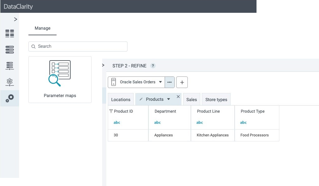
Click New Parameter Map to create a new map. You can create a parameter map by manually entering your key and value pairs along with the Default value for new keys. Also, advanced users can base a parameter map on a custom SQL statement.
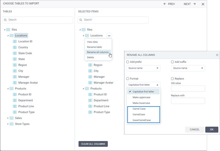
Use more bulk formatting options for naming dataset columns
You can now use different camelCase options when renaming all columns for a new table that you add to a dataset in the Choose tables to import dialog. To do so, next to a table name, click More options > Rename all columns, and in the Format section, specify one of the following:
- Camel Case
- CamelCase
- lowerCamelCase
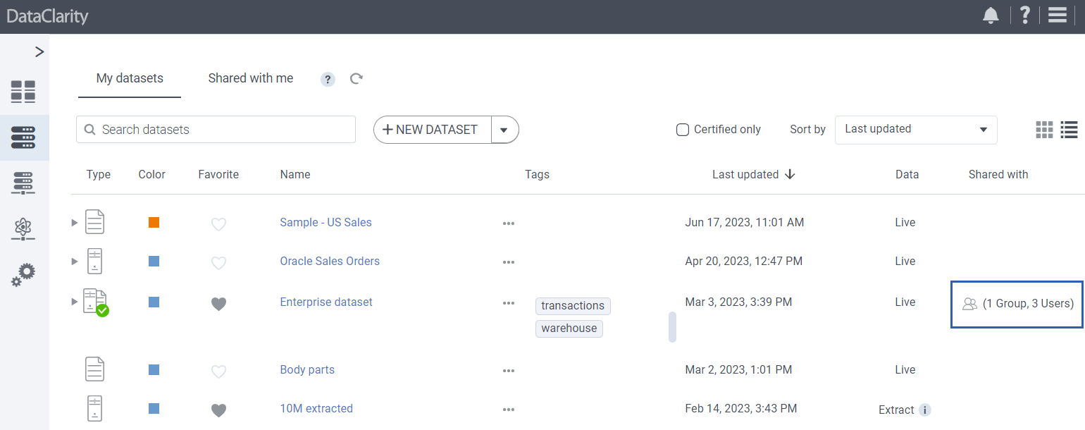
View more information about shared datasets, data connections and AI connections
Now, when using List view in My datasets, My data connections, and My AI connections, you can benefit from the new Shared with column providing the number of groups and users with whom you shared the specific item.
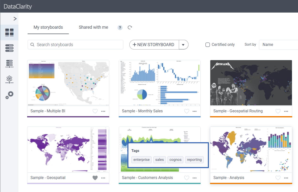
View storyboard’s description and tags in Tile view
Tags are keywords that help users better categorize and find storyboards that you can set by using More options for each individual storyboard.
Starting with this release, you can quickly preview assigned tags and description of a storyboard by hovering over its tile.
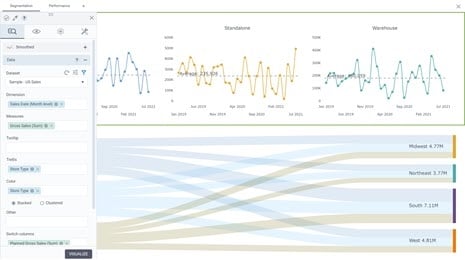
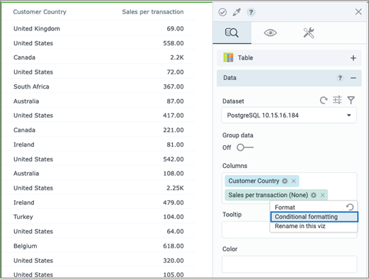
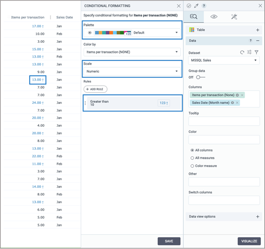
Use conditional formatting for values in Table widget
You can now highlight values in a Table widget with different colors and icons based on configurable rules. Click on the gears icon next to the column and then select Conditional formatting.
To better track changes in your data, you can now highlight values in the Table widget with different colors and icons based on the configurable rules. When selecting a column for analysis, click Options and select Conditional formatting.
Then, configure a rule by adding a condition and value based on which the data must be highlighted. To highlight the data with the specific rule, you can select a Text color, Background color, and Indicator icon.
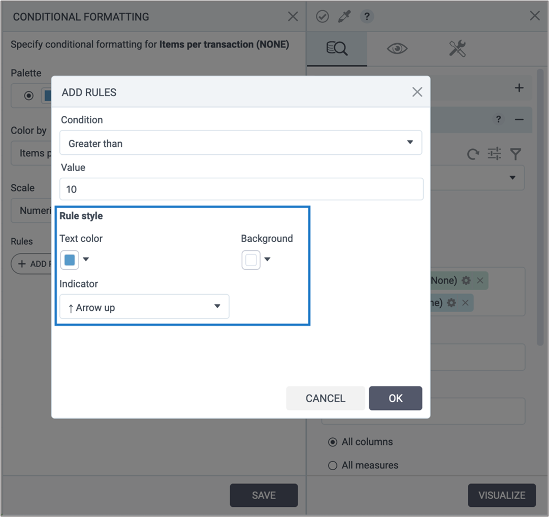
After saving the new rule, click Visualize and preview the results in your visualization. To customize conditional formatting, you can select a suitable palette, and specify which scale to apply – Numeric or Percentage.
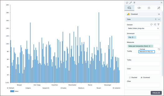
Change the displayed name for columns in all charts
You can now change the displayed name of columns in all chart widgets. Click Options next to the column, and then select Rename in this viz. Then, input the desired name and confirm. Changes are reflected in the chart legend.
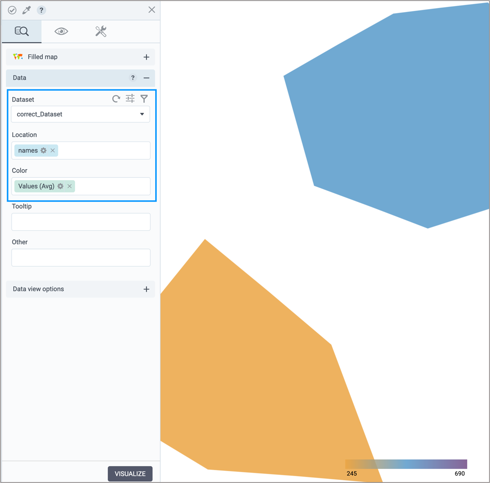
Create custom maps based on GeoJSON
Now, you can use the Filled map widget to visualize custom shapes predefined by coordinates in a GeoJSON file. To do so, on the appearance tab, select Custom map from Map options, and enter JSON data.

Make sure you select a dataset that has corresponding geo-dimension data and visualize the map. You can use the Reverse geo data switch if GeoJSON has reverse coordinates for a shape.
Want to learn more?
-
- Download the latest version today!
- Download Release Notes 2023.1 now!
- Explore all DataClarity releases.
- Get an overview of DataClarity Unlimited Analytics.
You might also be interested in…
-
 Releases
Inside DataClarity 2023.4: Enhanced UI/UX and Data Prep, and more

DataClarity 2023.4 delivers modern innovation and sustainable free data and analytics capabilities for ISV’s, SaaS providers, and IT teams. -
 Releases
Now available in DataClarity 2023.3: New KPI Widget, Custom JavaScript Code for Chart Actions, and more
Explore the latest features designed to help you create visualizations that are more meaningful, personalized, and interactive, leading to deeper insights into your business. -
Releases
Inside DataClarity 2023.2: Relative Time Calcs, Chart Filters on Aggregated Measures, and more
DataClarity 2023.2 release introduces the capability to employ chart filters on aggregated measures, instantly switch columns, perform relative time calculations, actions for Bullet charts, and more.