See What’s New in DataClarity 2023.5: Support for Trino Database Connections, In-Product Notifications for Shared Content, and more

- Expansion of data preparation with new connectivity options, in-product notifications for shared content, and enhanced dataset identification with visual icons.
- Enjoy multiple enhancements to streamline collaboration and elevate overall usability and user experience, revamped GuideMe, and improved profile avatars.
- Level up your storyboard design and visualizations with improved UI pane and persistent dataset selection, enhanced table widget appearance, and margin settings for Gauge chart titles.
- Empower end users to extract deeper insights with advanced data filtering previously reserved for authors.
Get DataClarity or upgrade to DataClarity 2023.5 today to take advantage of all these great innovations. Now, let’s take a closer look at some of the greatest features in this release.
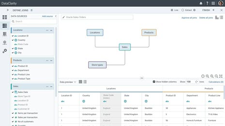
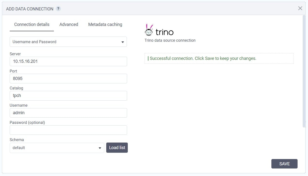
Support for Trino Database Connections
The new release includes the expansion of our database connectivity options with the addition of support for Trino databases.
With this enhancement, our platform users can now establish connections to Trino databases, which provides them with access to a wider range of data sources for enhanced data analysis and exploration.
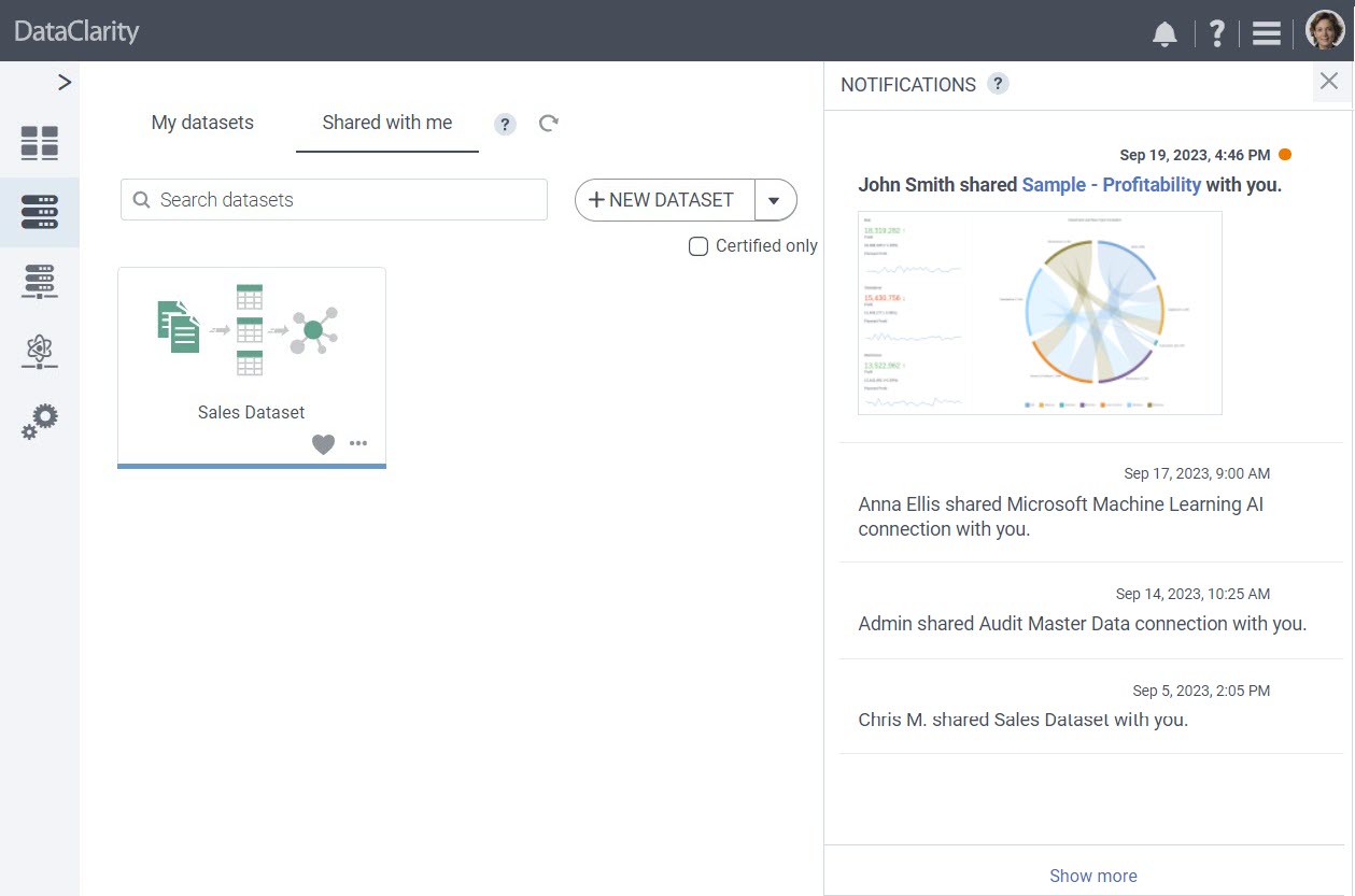
In-Product Notifications for Shared Content
Now, when someone shares data and AI connections, datasets, palettes, storyboards, or parameter maps with you, our platform will provide in-product notifications.
These notifications can be accessed conveniently through the alerts toolbar icon integrated into the user interface, ensuring that you receive immediate updates regarding shared resources.
For shared storyboards, the notification system also offers a preview of the storyboard, provided a thumbnail or preview tile is available.
Enhanced Dataset Identification with Visual Icons
We’re excited to introduce an enhancement that simplifies the identification of datasets in your datasets list view. Now, at a glance, you can discern whether a dataset is created from personal data files, database or server sources, or a combination of both, thanks to new visual icons.
In the tile view of datasets, we’ve replaced the generic dataset image with three distinct icons. Each icon represents a different type of data source:
- Personal data files icon clearly indicates datasets that originate exclusively from personal data files, making it easy to identify datasets created from your local files.
- Database/server sources icon is used for datasets sourced entirely from databases or servers, simplifying the recognition of datasets connected to external data sources.
- Mixed data sources icon indicates datasets that combine personal data files with database or server sources.
![]()
These visual icons streamline dataset identification, removing the necessity to open dataset lineages or scrutinize details to discern their source.
Persistent Dataset Selection
To enhance the efficiency of chart creation within storyboards and provide a seamless experience, we’re introducing a valuable enhancement that memorizes your last selected dataset, both within the same session and between sessions.
Whether you’re working within the same session or returning to your work later, the application remembers your last selected dataset. When you add a new chart, the previously chosen dataset is automatically pre-selected. This feature significantly streamlines the chart creation process, eliminating the need for repetitive dataset selections.
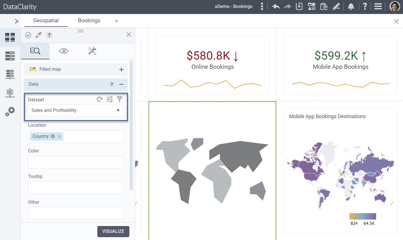
This persistent dataset selection ensures that your workflow remains uninterrupted, making it easier than ever to design storyboards with multiple charts.
Improved UI Pane Movable Indicators
As part of our ongoing commitment to improving the user experience in storyboard design, we are introducing a valuable enhancement that improves the visibility of movable UI panes.
The UI panes, which allow access to the widget library, widget configuration settings, storyboard pages, palettes, and more, now have a clear indicator in the headers, making it evident to users they can be dragged and repositioned within the canvas.
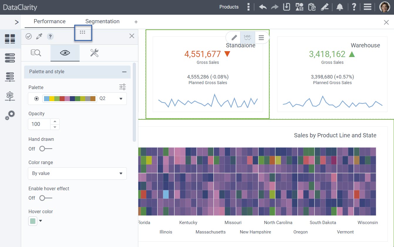
This improvement grants users greater control and convenience when crafting their storyboards.
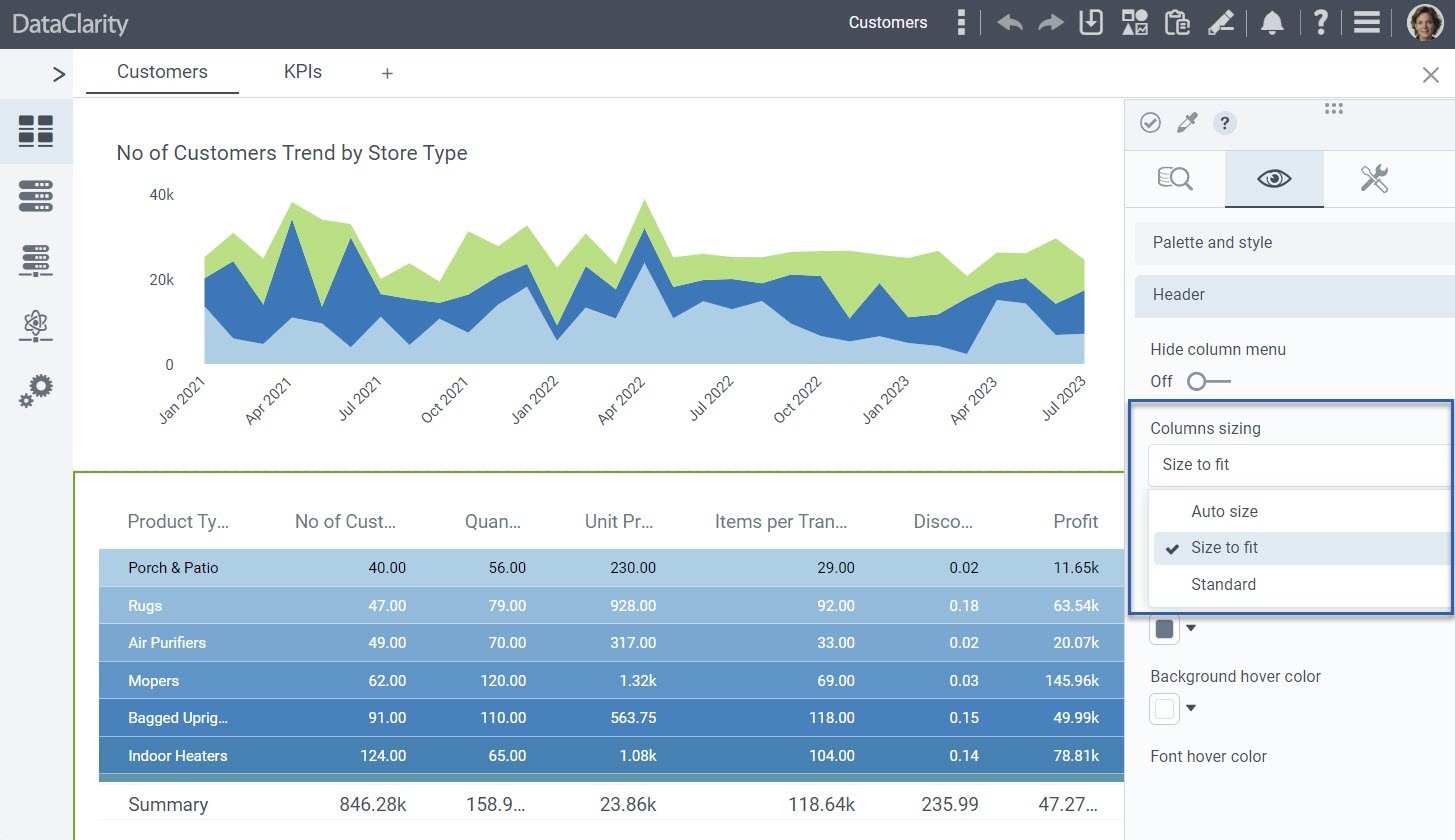
Enhanced Table Widget Appearance with Column Size Control
This new enhancement puts you in the driver’s seat when it comes to the appearance of table widgets. Now, you have the power to control how columns adapt to content and screen dimensions, making your data presentations even more flexible.
We’ve extended the “Custom Actions” to include the following:
-
- Auto Size – with this option, columns will automatically determine their width based on cell contents, ensuring optimal sizing for your data.
- Size to Fit – choose this option to let columns adjust their widths automatically, making sure all visible content fits the screen perfectly, enhancing the readability of your tables.
- Standard – for those who prefer to maintain the original column sizes without automatic adjustments, the standard option provides the same behavior you’re accustomed to (prior behavior).

These enhancements empower you to fine-tune the appearance of your table widgets, ensuring that your data presentations are not only informative but also visually appealing and adaptable to various screen dimensions.
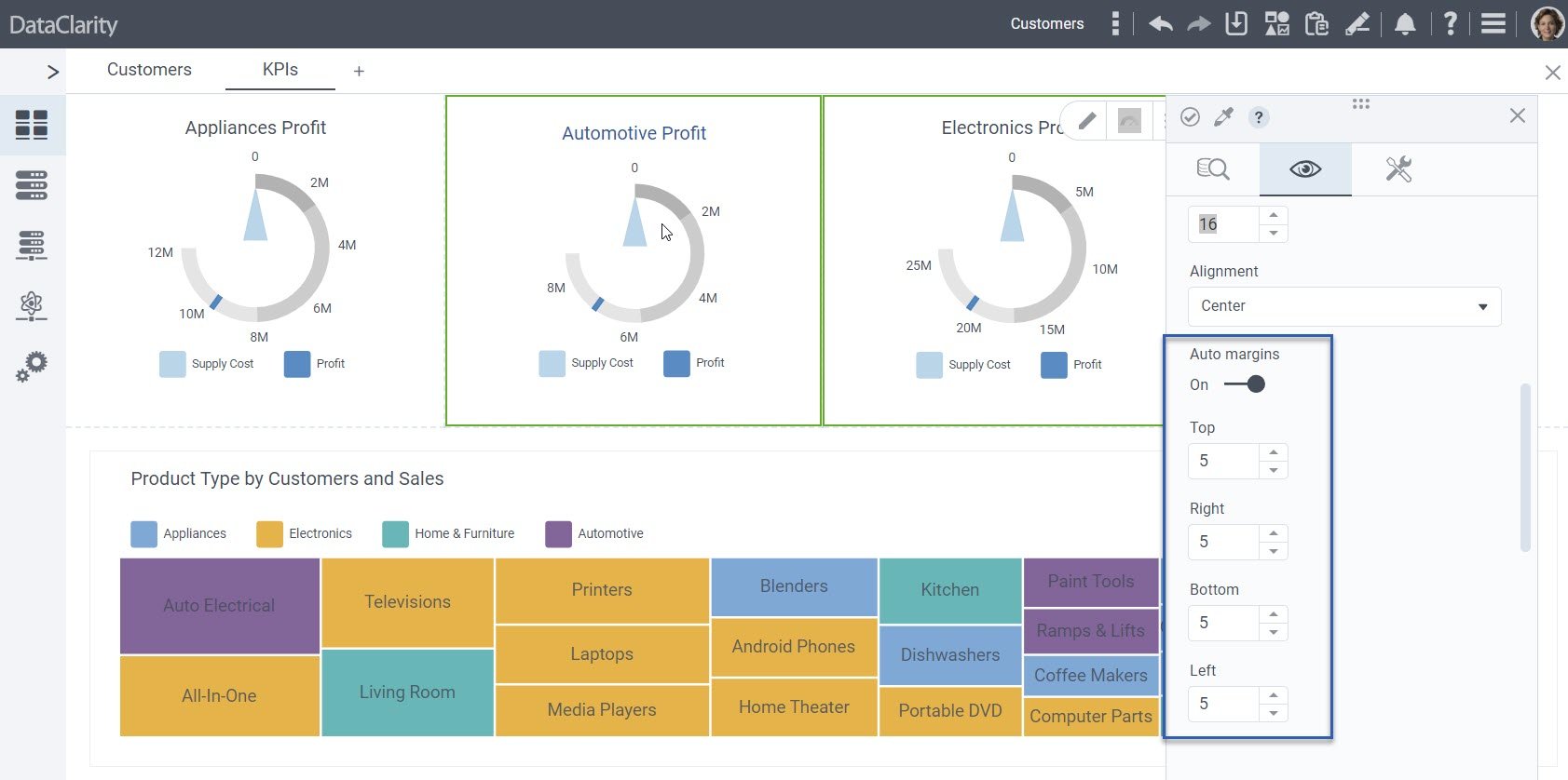
Customizable Margins for Gauge Chart Titles
DataClarity 2023.5 introduces margin settings for Gauge chart titles, harmonizing customization options across chart types for a consistent design experience.

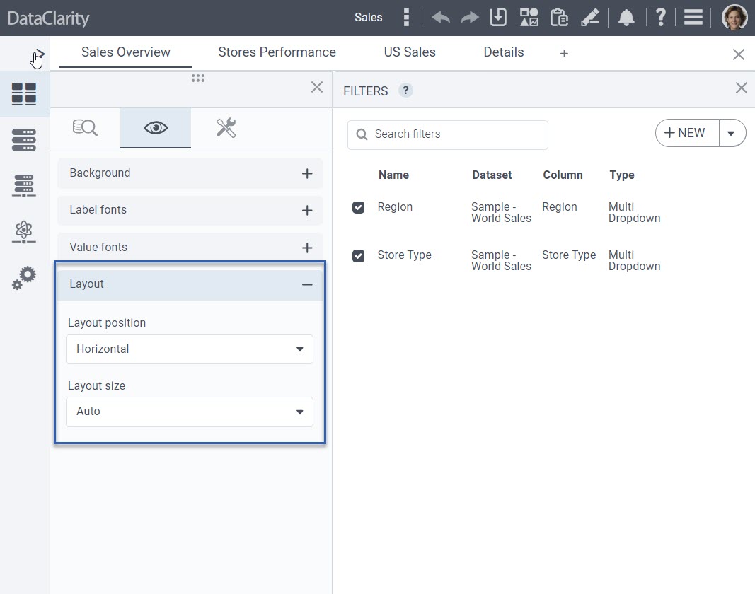
Enhanced Control Over Filter Widget Layout
In this release, we’ve made significant enhancements to boost flexibility and design options within your storyboards. Authors now enjoy advanced control over the layout style of filter prompts within a single filter widget, with two options to choose from:
-
- Vertical Layout (existing behavior) – this layout continues to stack filter prompts one below the other, maintaining the traditional approach.
- Horizontal Layout (new feature) – with this exciting addition, filter prompts can now be arranged side by side, horizontally. This option is ideal for storyboards requiring a top row of filters, eliminating the need to add multiple single filter widgets and manually align them.
These enhancements streamline the storyboard design process, offering greater efficiency and enhancing visual appeal.

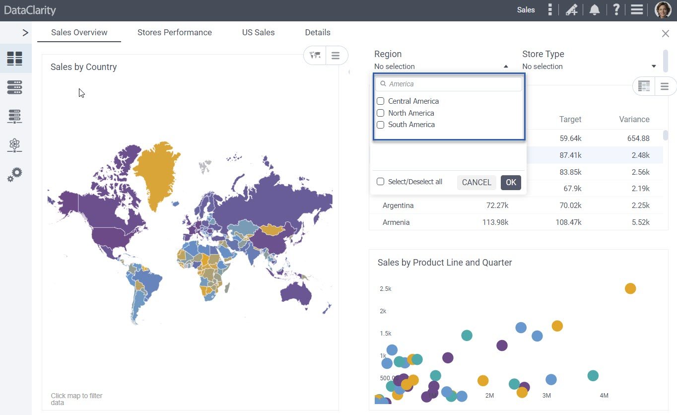
Improved Prompt Search Functionality
We’ve upgraded the search feature to allow partial value matching in expressions using a “like” clause. This enhancement simplifies finding relevant items. For example, searching “America” will yield results like “North America”, “Central America”, and “South America.”

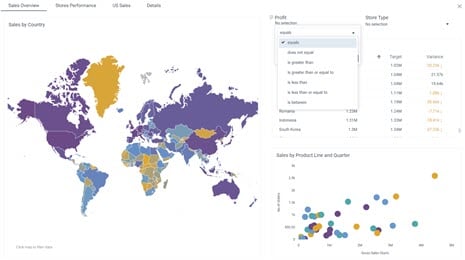
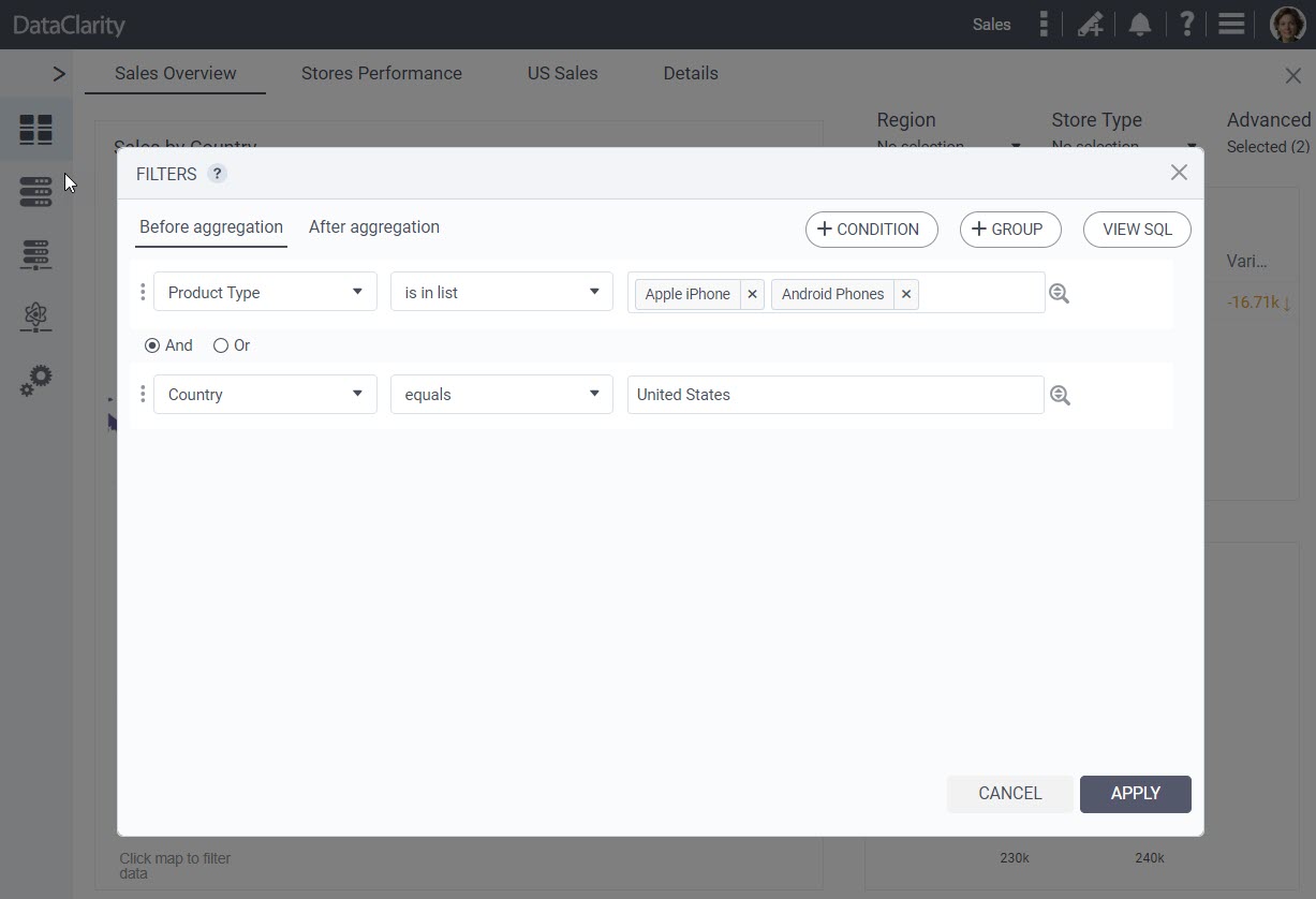
Advanced Data Filtering
We are excited to introduce a powerful enhancement that bridges the gap between authors and end-users in chart and storyboard consumption. With this update, authors can now empower end-users with advanced data filtering features as follows:
-
-
- Advanced type prompts – authors can now define “advanced” type prompts for end-users, enabling them to specify filter conditions for any columns within their charts and storyboards. This means that end-users have the flexibility to create complex filter criteria tailored to their needs.
- Grouping conditions – end-users can group conditions and use logical operators (AND/OR) to create sophisticated filter expressions. This enhancement enables more precise data refinement within charts and dashboards.
- Customizable column lists – authors can define lists of columns that end-users can utilize in these advanced filters. This customization ensures that end-users can access relevant data fields for their filtering requirements.
With these enhancements, the advanced data filtering experience previously reserved for authors is now accessible to end-users. This added flexibility and control empower users to extract deeper insights from their data within the context of storyboards and charts.

-
Improved Filter Indicators and Criteria Visibility
This release brings substantial improvement aimed at providing users with enhanced clarity concerning applied filters and their respective criteria.
When a visualization is filtered due to interactions with other charts or filter widgets, we now display a filter icon on the affected chart. This icon serves as a clear visual indicator that the data within the chart has been filtered.
Clicking on the filter icon opens a convenient popup displaying the filter criteria that have been applied. Users can now easily understand the specific filtering conditions affecting the visualization.
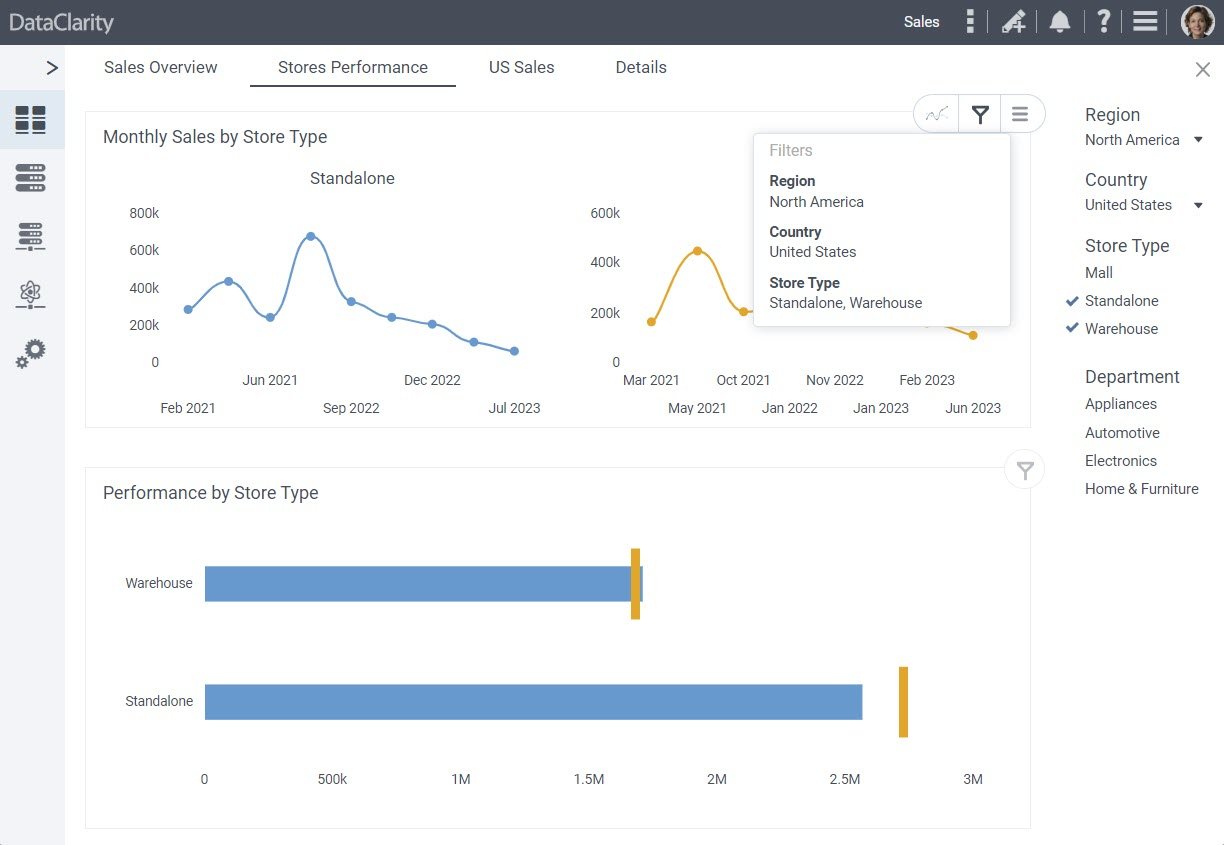
With these enhancements, users gain valuable insights into the impact of filter interactions within storyboards.
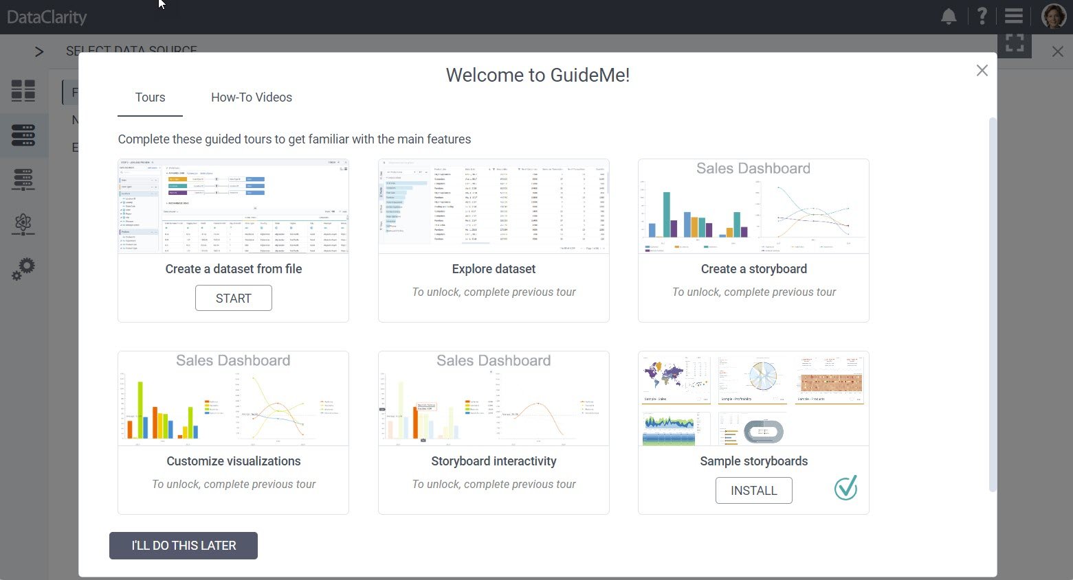
Revamped GuideMe with Modern Design and Latest Features
We’re excited to introduce an update to our “GuideMe” capabilities. Our sample storyboards now align with the most recent features, offering up-to-date content.
The refreshed samples not only showcase the latest and greatest capabilities, but also feature a modern, sleek design and user-friendly exploration that levels up the overall platform experience.
Enhanced Profile Avatars with Support for Larger Images
This release introduces an enhancement that enriches your profile customization and sharing experience. Leverage the capability of uploading larger avatar images, now accommodating files of up to 3MB in size, all while maintaining peak performance when displaying avatars in sharing dialogs.
By extending the maximum allowable file size for avatar uploads, scaling it from 0.5MB to a robust 3MB, we empower you to employ higher-resolution images for a more detailed expression of your identity.
To ensure unimpeded performance, we’ve implemented an intelligent optimization mechanism that automatically resizes avatars to an ideal size, ensuring that, even with larger image uploads, performance remains unaffected when displaying avatars within sharing dialogs.
These technical enhancements broaden your profile customization horizons and streamline the sharing experience, simplifying the identification of users and fostering seamless collaboration.
Want to learn more?
-
- Learn more about DataClarity Unlimited Analytics.
- Get DataClarity or upgrade to DataClarity 2023.5 today!
- Download Release Notes 2023.5 now!
- Explore all DataClarity releases.
You might also be interested in…
-
 Company
Free Unlimited Data and Analytics Platform is Now Available

Exciting news! DataClarity unveiled an incredible offering – DataClarity Unlimited Analytics. This modern embeddable data and analytics platform is fully packed with amazing capabilities. -
Releases
Inside DataClarity 2023.4: Enhanced UI/UX and Data Prep, and more

DataClarity 2023.4 delivers modern innovation and sustainable free data and analytics capabilities for ISV’s, SaaS providers, and IT teams. -
Releases
Now available in DataClarity 2023.3: New KPI Widget, Custom JavaScript Code for Chart Actions, and more
Explore the latest features designed to help you create visualizations that are more meaningful, personalized, and interactive, leading to deeper insights into your business.