Beyond Colors: DataClarity’s Revolutionary Approach to Branding Embedded Analytics

DataClarity: A Veteran in Tailored Analytics
For years, DataClarity has championed the importance of personalization in embedded analytics. This platform goes beyond mere data processing, allowing you to present information in a way that resonates with your brand’s unique style and values.
Diverse Palettes and User-Driven Styling
DataClarity’s journey started with an array of predefined palettes, including qualitative, sequential, and divergent types. However, the true power lies in its long-standing capability to let users fashion and modify palettes. This feature, an integral part of DataClarity for years, enables perfect alignment with your brand’s color scheme.
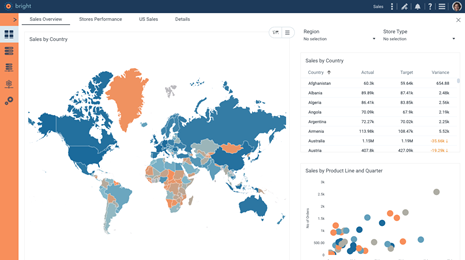
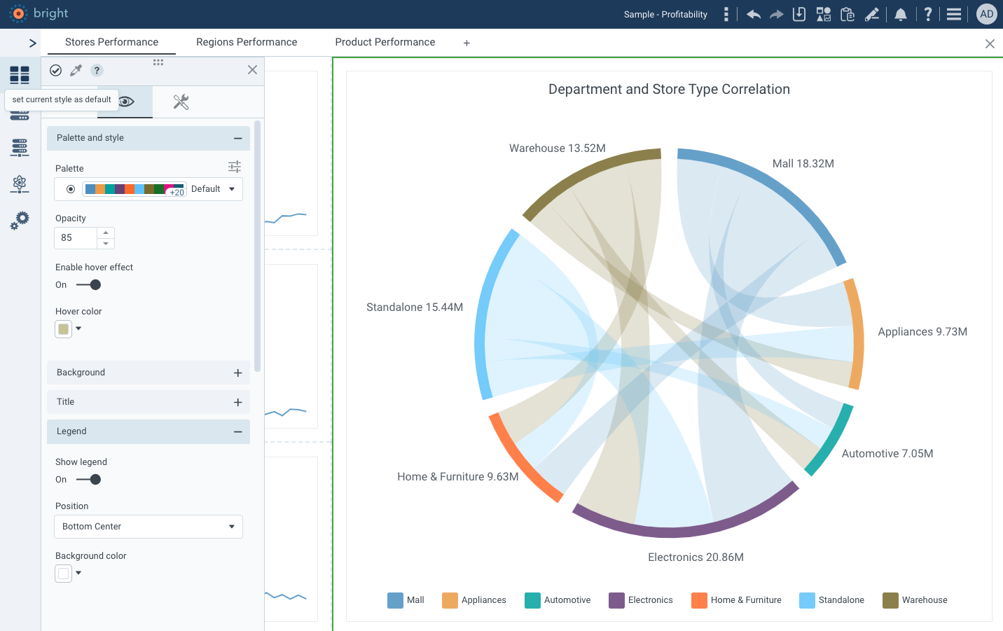
 Tailoring Analytics to Your Brand: DataClarity’s Styled Storyboard in Action
 Tailoring Analytics to Your Brand: DataClarity’s Styled Storyboard in Action
Palette Sharing: Fostering Organizational Cohesion
One of DataClarity’s most praised features, available for years now, is the ability to share custom palettes. This not only ensures consistency in data presentation across teams but also promotes a unified branding approach organization-wide.
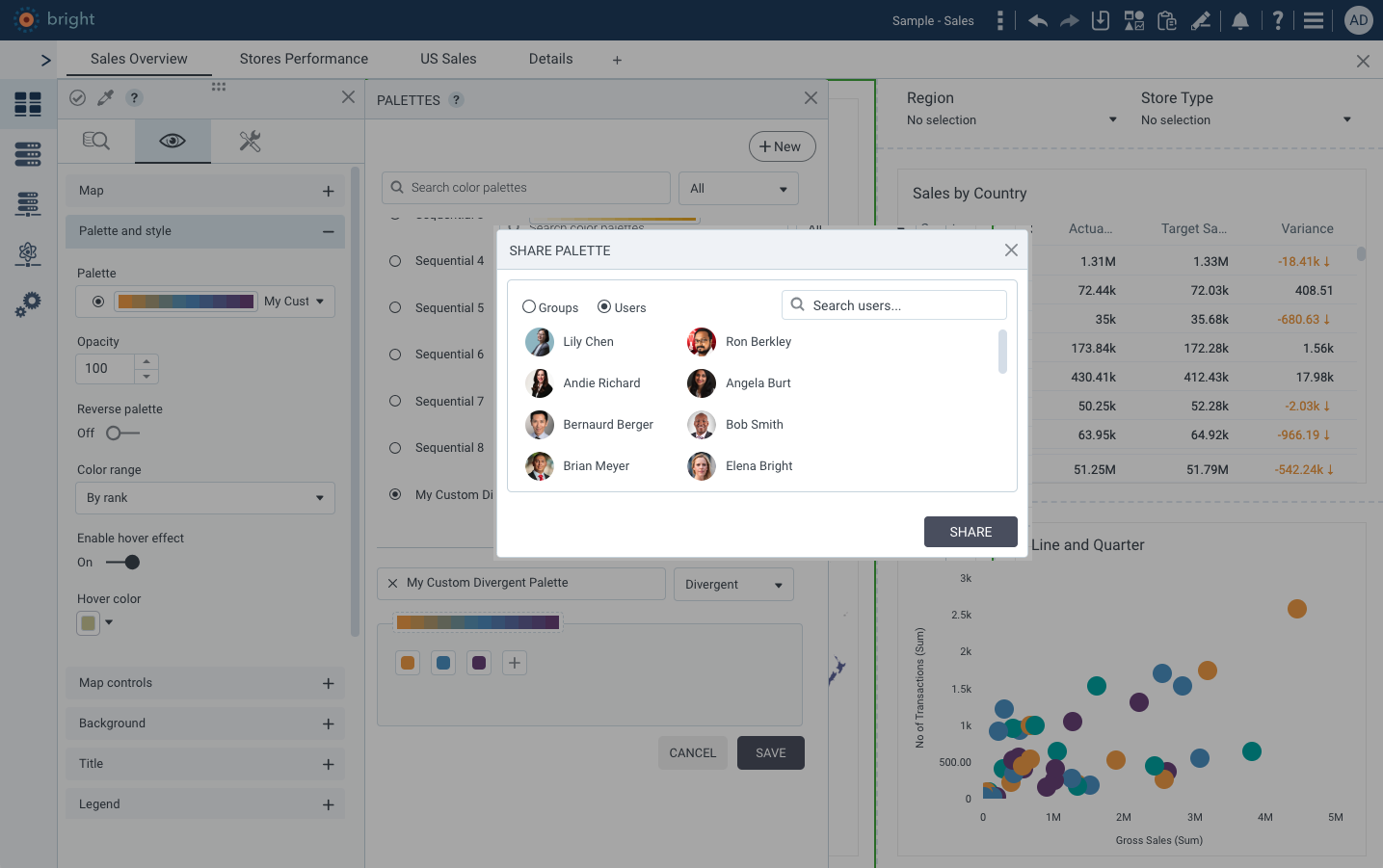
Unified Vision: Sharing Custom Palettes Across Teams with DataClarity
Role-Based Access Control: Steering Brand Consistency Across the Organization
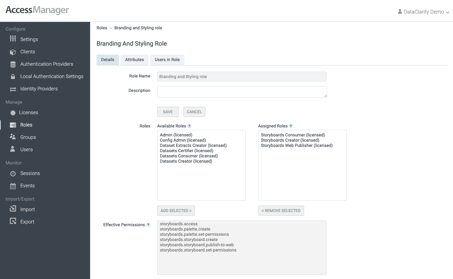
DataClarity’s dedication to maintaining a cohesive brand identity extends into its robust Role-Based Access Control (RBAC) system. This feature plays a crucial role in how palettes are created and disseminated within an organization.
By enabling precise control over who can create and share palettes, DataClarity empowers organizations to streamline their branding efforts effectively.
For instance, an organization can designate a specialized team responsible for developing and curating palette standards. Once these palettes are created, they can be shared across the entire analytics community within the organization.
This centralized approach ensures that all users, regardless of their role or department, utilize the same set of approved palettes, thus maintaining a uniform branding standard across all analytics outputs.
Control and Cohesion: Role-Based Access in DataClarity’s Palette Management
Efficient Styling and Personalized Design
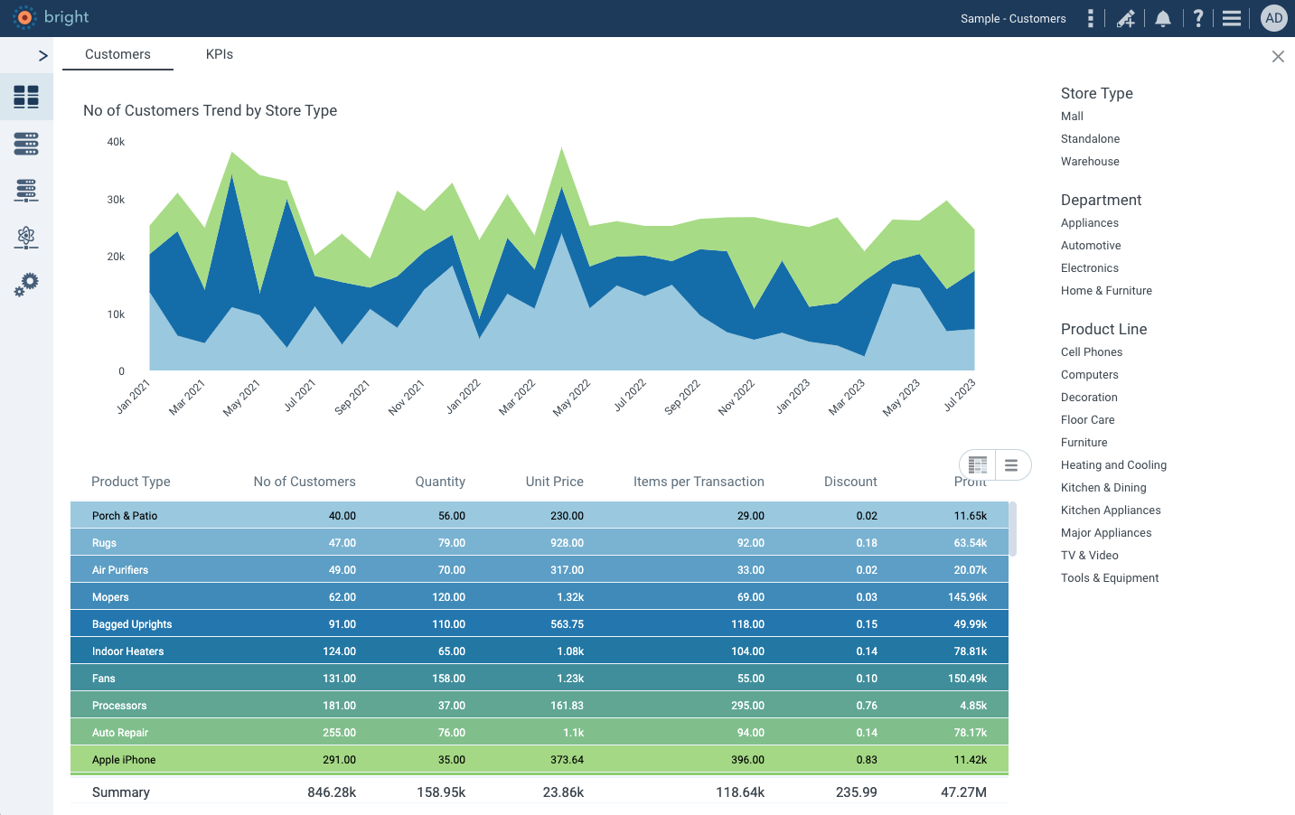
DataClarity has always been about efficiency and tailored design. Authors can define default styling profiles for dashboards, avoiding repetitive styling tasks. The platform offers over 100 chart styling settings, allowing authors to set these as defaults or apply them across different charts, a testament to DataClarity’s commitment to user-centric design.
Efficiency Meets Elegance: Setting Default Styling Profiles in DataClarity
Mastering Visualization with Over 70 Built-in Charts
DataClarity Unlimited Analytics stands out in the analytics industry not just for its highly configurable capabilities, but also for its extensive range of visualization options. With over 70 built-in chart types, the platform covers an extraordinary breadth of visualization needs, establishing itself as a master of data representation.
From basic bar graphs to complex scatter plots, each chart type is designed with precision and user experience in mind, ensuring that every data story is told effectively and elegantly.
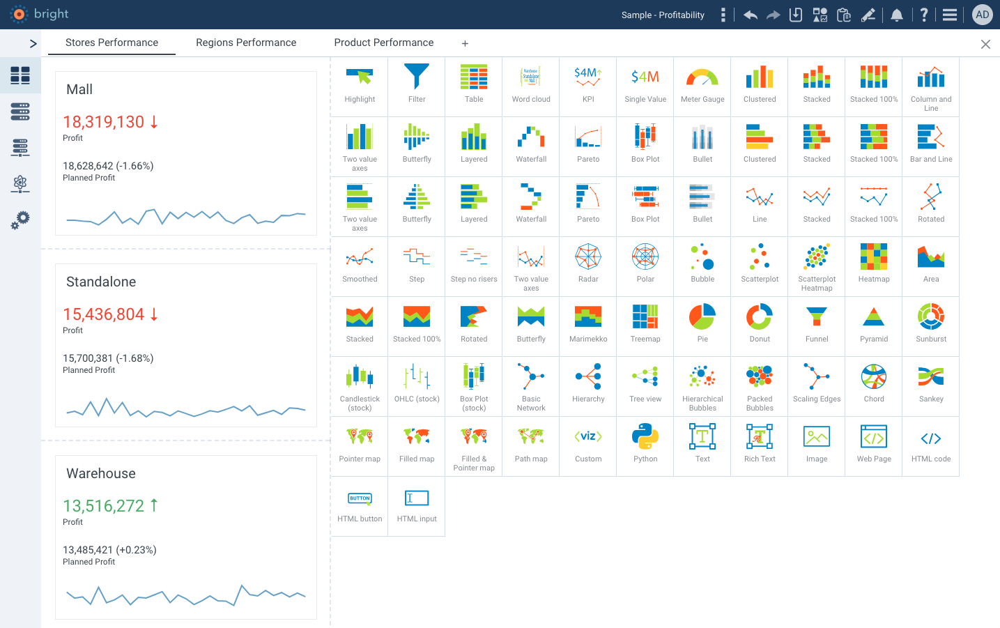
Diverse Visualizations: Over 70 Built-in Chart Types by DataClarity
Seamless Integration with Custom Visualizations
Another noteworthy feature of DataClarity Unlimited Analytics is its seamless compatibility with custom visualizations. Whether you’re using standard chart types or bringing your own unique visualizations (“Bring Your Own Chart”), the platform ensures that your chosen palettes apply uniformly. This is a game-changer for SaaS applications aiming to provide a consistent user experience.
By enabling custom charts to inherit the same palette styles as standard features, DataClarity guarantees that all visualizations, regardless of their origin, maintain the same look and feel. This ensures a seamless, branded experience across all analytics outputs, further solidifying the platform’s position as a leader in customizable and integrated data visualization solutions.
Versatility Visualized: Comparing Standard and Custom Charts in DataClarity
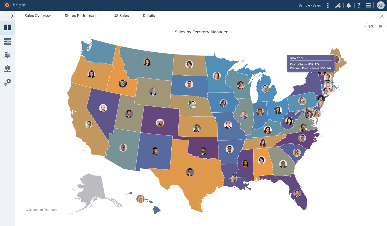
Smart Palette Application: Intelligent Color Mapping for Data Insights
DataClarity’s prowess in data visualization is further exemplified by its intelligent palette application, a feature that has been enhancing heatmaps and geospatial charts for years. When using a divergent palette like the classic red-yellow-green, the platform demonstrates its ingenuity in color application. It’s not just about assigning colors; it’s about representing data values with intuitive precision.
The transition through the palette is where DataClarity truly shines. Negative values seamlessly integrate into the red spectrum, symbolizing caution or decrease. As values approach neutrality, they transition through yellow, a color representing tolerance or a middle ground.
Finally, positive values emerge in the green spectrum, indicating growth or positive performance. This smooth progression through colors not only enhances the visual appeal but also aids in quick, accurate data interpretation.
Intuitive Insights: DataClarity’s Heatmap with Intelligent Color Mapping
Elevating User Experience with Refined Interactions
DataClarity’s commitment to a rich user experience is evident in the smallest of details, which cumulatively add a touch of class to its analytics platform. A prime example of this is seen in the platform’s tooltip design. When users interact with charts, specifically in areas like heatmaps or geospatial visuals, the tooltip background and borders dynamically adapt to match the color of the region being hovered over. This subtle yet impactful detail ensures a seamless and engaging user experience.
This feature isn’t just about aesthetics; it’s about creating an intuitive and smooth interaction that feels natural to the user. By having the tooltip elements harmoniously blend with the data points, DataClarity eliminates visual jarring and enhances focus on the data being analyzed. It’s these thoughtful refinements that elevate DataClarity from a mere analytics tool to a sophisticated platform that prioritizes user comfort and engagement.
Sophisticated Interactions: Adaptive Tooltip Design for Enhanced User Experience
Full-Spectrum Branding and White Labeling
Beyond visualizations, DataClarity Unlimited Analytics excels in full-platform branding and white labeling. This encompasses not just the analytics but all user interfaces, offering SaaS applications a seamless brand integration. With its comprehensive customization, including robust Role-Based Access Control (RBAC), DataClarity ensures every aspect of the user experience – from analytics to data management – resonates with your brand’s unique identity, making it an ideal choice for SaaS providers seeking a cohesive and branded user experience.
Seamless Brand Integration with DataClarity Unlimited Analytics
Seamless Integration Meets Unmatched Flexibility
DataClarity Unlimited Analytics isn’t just a tool; it’s a game-changer in the realm of embedded data analytics, offering unparalleled flexibility, intelligent design, and collaborative features. And the best part? It’s available for FREE, with optional premium support and service packages tailored to meet your specific needs.
Embark on a Journey of Enhanced Embedded Analytics
Are you ready to elevate your organization’s data storytelling with unparalleled styling and design? Discover more about how DataClarity Unlimited Analytics can revolutionize your approach to data visualization and branding.
Want to learn more?
-
- Explore DataClarity Unlimited Analytics.
- Discover integrations and data connectors supported by DataClarity.
- Get started with Free Embedded Analytics today.
Latest Articles
-
 GenAI/ML
Advanced Data Capabilities Power GenAI/LLM & Embedded Analytics

See how enterprise-grade embedded analytics and data solutions are reshaping the global SaaS scene with enhanced capabilities, real-time insights, and cutting-edge, AI-driven self-service. -
Branding & White Label
Beyond Colors: Brand & White Label Embedded Analytics
In the world of embedded analytics, branding isn’t just a detail – it’s a cornerstone. Effective branding ensures that analytics are not only insightful but also visually consistent with the company’s identity. -
Embedded Analytics
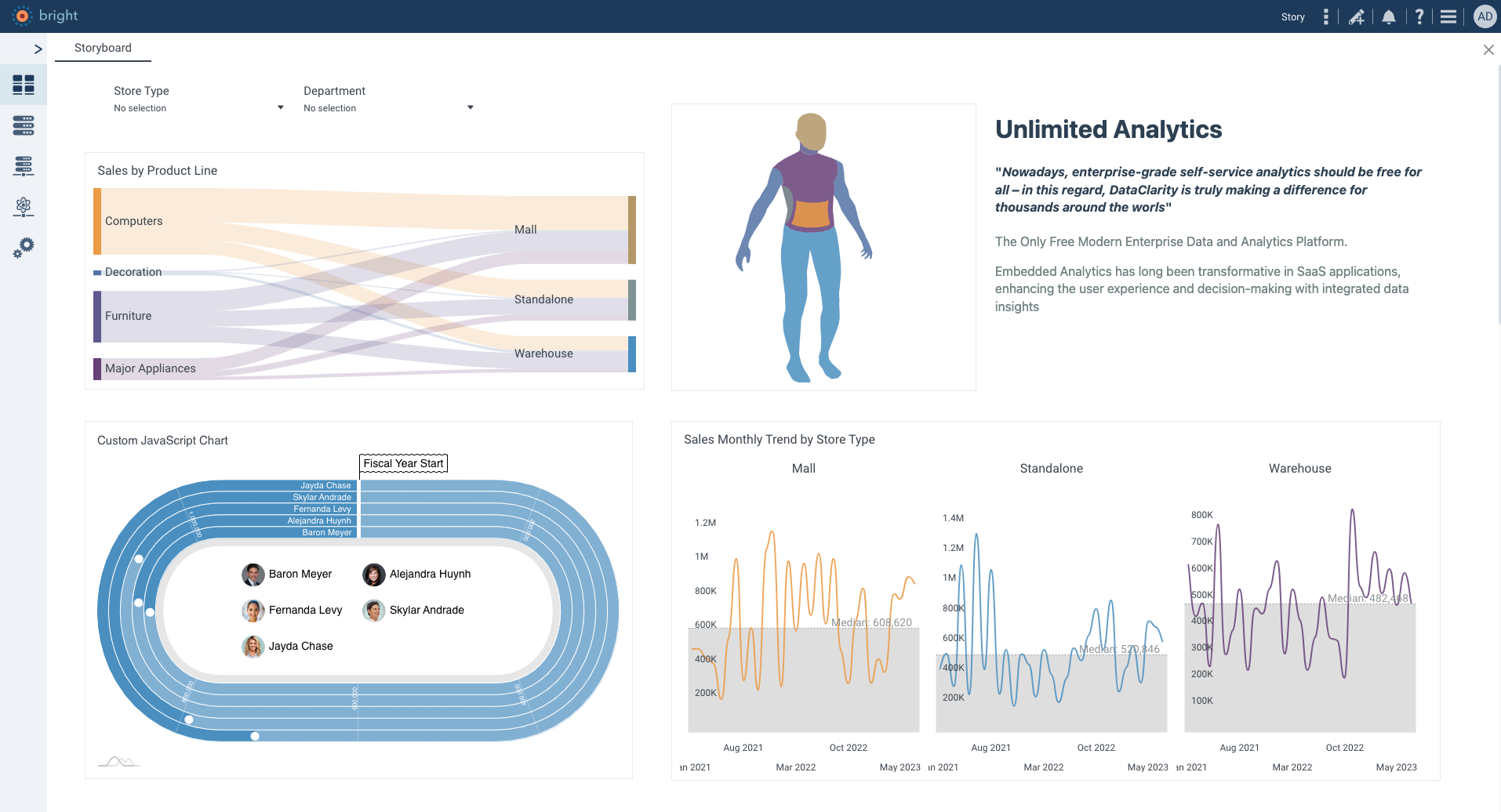
The Evolution of SaaS Applications: The Transition to Embedded DATA Analytics
Embedded Analytics has long been transformative in SaaS applications, enhancing the user experience and decision-making with integrated data insights. As the digital landscape evolves, a new frontier, Embedded DATA Analytics, emerges.